22 Wainscoting Wall Panel Ideas to Upgrade Plain Walls
Plain walls can make a room feel unfinished, even when the furniture is beautiful. These Wainscoting Wall Panel Ideas show how simple trim, moulding, colour, and thoughtful styling can give any room more depth and character without making it feel overdone.
This article is all about turning blank walls into polished features that still work in real homes. From soft white panels to dramatic painted walls, hallway upgrades, dining room details, and cozy living room finishes, you’ll find ideas that feel stylish but practical. In my experience, wall panels work best when they support the room instead of competing with everything else. With the right scale, colour, and lighting, even a small wall can feel more custom, balanced, and thoughtfully designed.
1. Black Window Trim With Traditional Wall Moulding
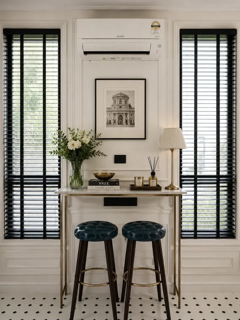
Black window trim gives this bright corner a crisp, tailored edge. The tall shutters frame the console beautifully, while white traditional wall moulding keeps the background polished without feeling heavy. Dark tufted stools, brass legs, fresh flowers, and simple artwork add a refined balance of contrast and softness.
This idea works well when a wall already has strong symmetry, such as windows on both sides. Keep the console narrow so the area stays useful, then repeat black through frames, blinds, or seating. Among Wainscoting Wall Panel Ideas, this one feels classic, practical, and easy to adapt.
2. Classic Wainscoting With Decorative Mirror Panels
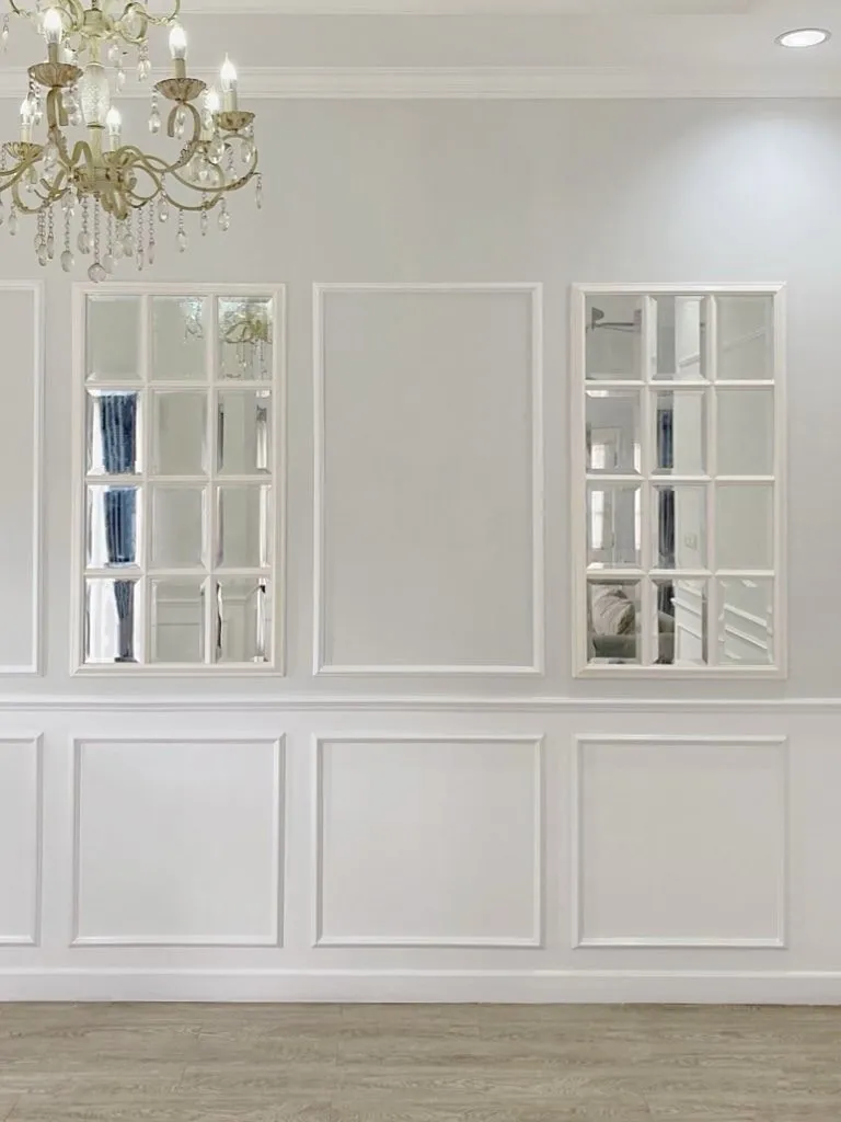
Mirror panels instantly make plain white moulding feel brighter and more open. The grid-like wall treatment adds structure, while the mirrored sections bounce light from the chandelier and nearby rooms. It creates a formal look without needing heavy furniture, bold paint, or busy wall art.
For real homes, this approach works best in dining rooms, hallways, or compact sitting areas that need more light. Keep the surrounding paint soft and neutral so the mirrors feel built-in rather than flashy. Avoid filling every panel, because a little empty moulding keeps the design calm.
3. Classic White Picture Frame Moulding Walls
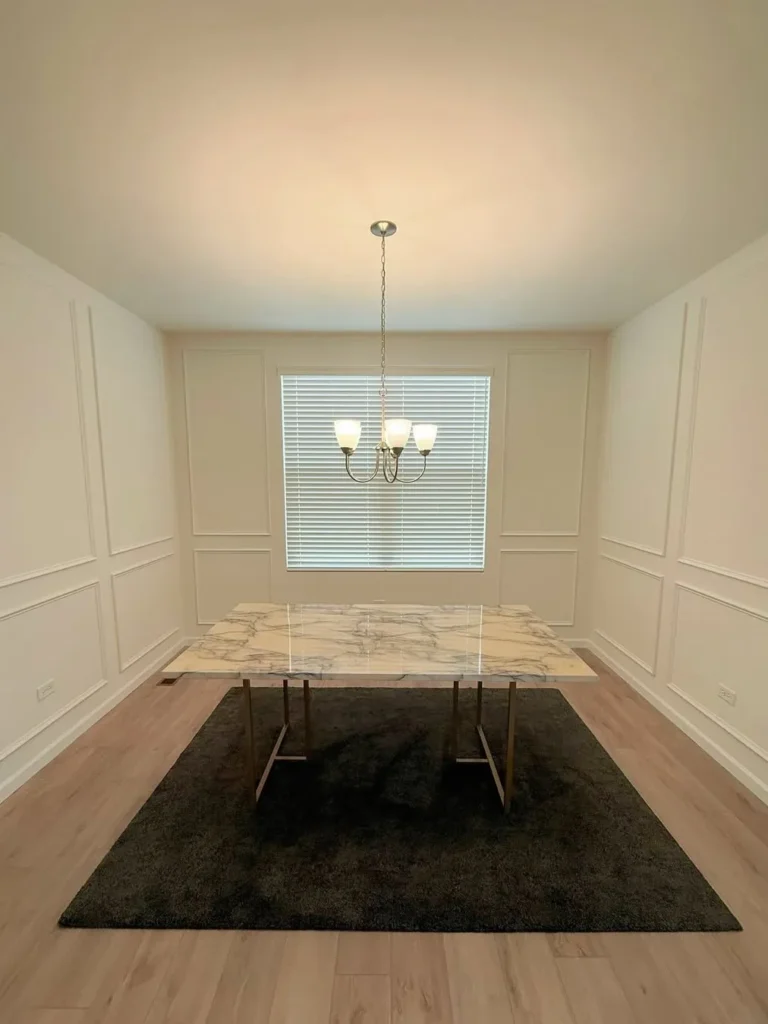
A simple dining room feels much more finished when the walls have quiet architectural detail. The white picture frame moulding adds rhythm around the table, while the marble top, dark rug, and small chandelier bring contrast without overcrowding the room. Clean symmetry makes the whole setting feel intentional.
This is a smart option for anyone who wants elegance without bold colour. Let the panel spacing guide furniture placement, then keep artwork minimal so the wall detail remains visible. A large rug under the dining table helps ground the room and prevents all-white finishes from feeling too flat.
4. Dark Moody Wainscoting Feature Wall
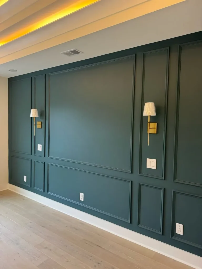
Deep green-blue panelling can turn one blank wall into a dramatic focal point. The slim moulding creates clean rectangles, while brass wall sconces add warmth against the darker paint. Because the wall is mostly uninterrupted, the colour feels rich and modern instead of visually cluttered.
This look works especially well in dining areas, media rooms, or lounge spaces where mood matters. Choose one strong wall and leave nearby surfaces lighter for balance. If using a dark paint colour, warm lighting is important because it keeps the panels dimensional, not dull or closed-in.
5. Decorative Wall Panels With Botanical Wallpaper
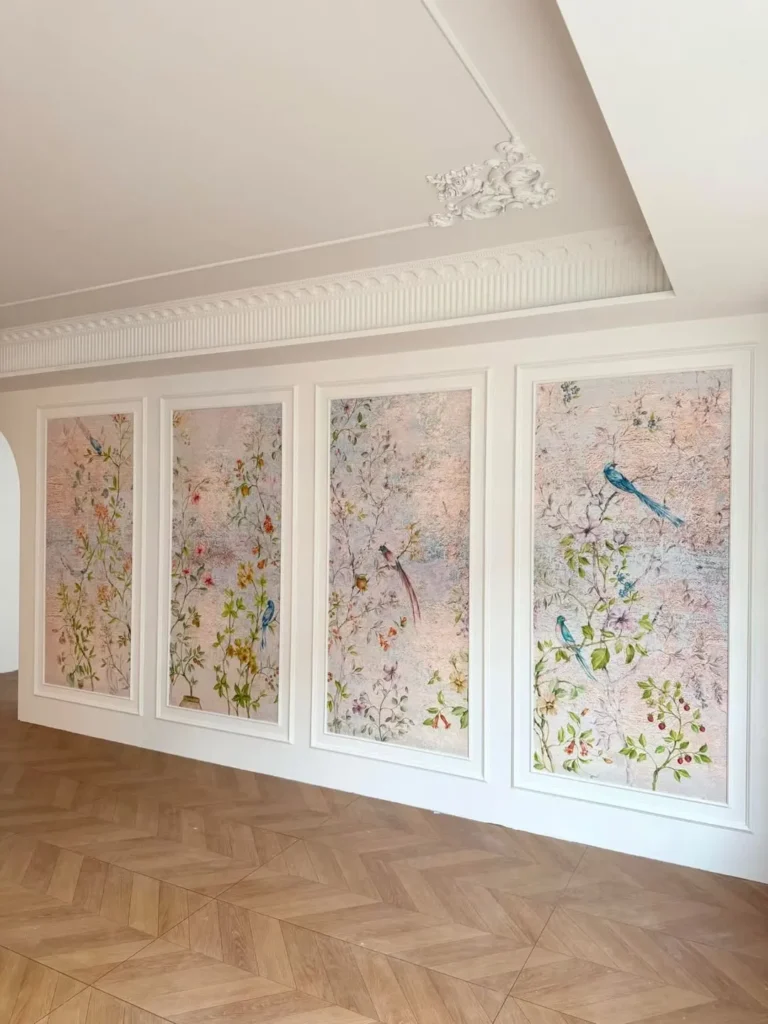
Framed botanical wallpaper brings softness to a formal wall treatment. The white trim acts like a gallery frame, allowing each floral panel to feel decorative without covering every inch of wall. Pale pinks, greenery, bird details, and warm wood flooring create a gentle, romantic finish.
The key is treating wallpaper as artwork rather than background noise. Use it inside selected panels, then keep trim, ceiling detail, and flooring calm. This is one of those Wainscoting Wall Panel Ideas that feels custom, but it can be recreated with peel-and-stick wallpaper in smaller spaces.
6. Elegant Hallway Picture Frame Wall Panels
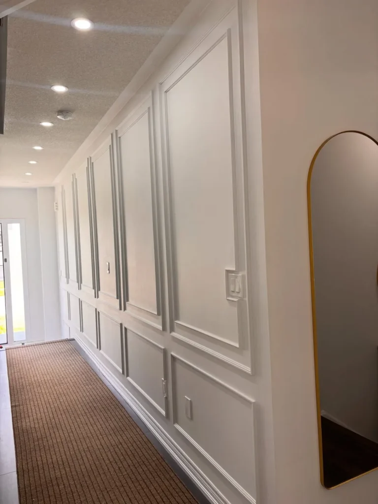
Long hallways look more considered when the walls have repeating picture frame panels. The tall white moulding stretches the space visually, while the runner and arched mirror add warmth and function. Even without heavy artwork, the passage feels layered, clean, and more connected to the rest of the home.
For everyday use, keep hallway molding simple enough to handle traffic and changing decor. A slim mirror, narrow runner, or small sconce can add personality without blocking movement. Matching the panels to the wall colour also helps the detail feel elegant instead of overly busy.
7. Entryway Console Styled With Wall Moulding
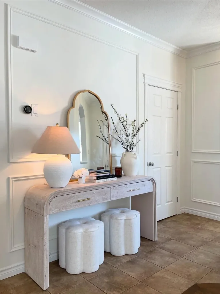
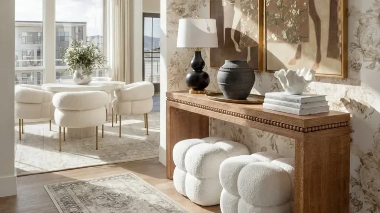
A small entryway can feel polished when the wall behind it has quiet structure. The moulding frames the console area, while the soft lamp, curved mirror, stacked books, branches, and cushioned stools create a welcoming first impression. Everything feels styled, but still useful for daily coming and going.
This idea works because the wall treatment gives simple furniture more presence. Choose a console that fits the width of the panel, then layer only a few practical pieces on top. A mirror, lamp, and vase are enough to make the entry feel finished without turning it into clutter.
8. Gallery Wall Framed With Picture Moulding
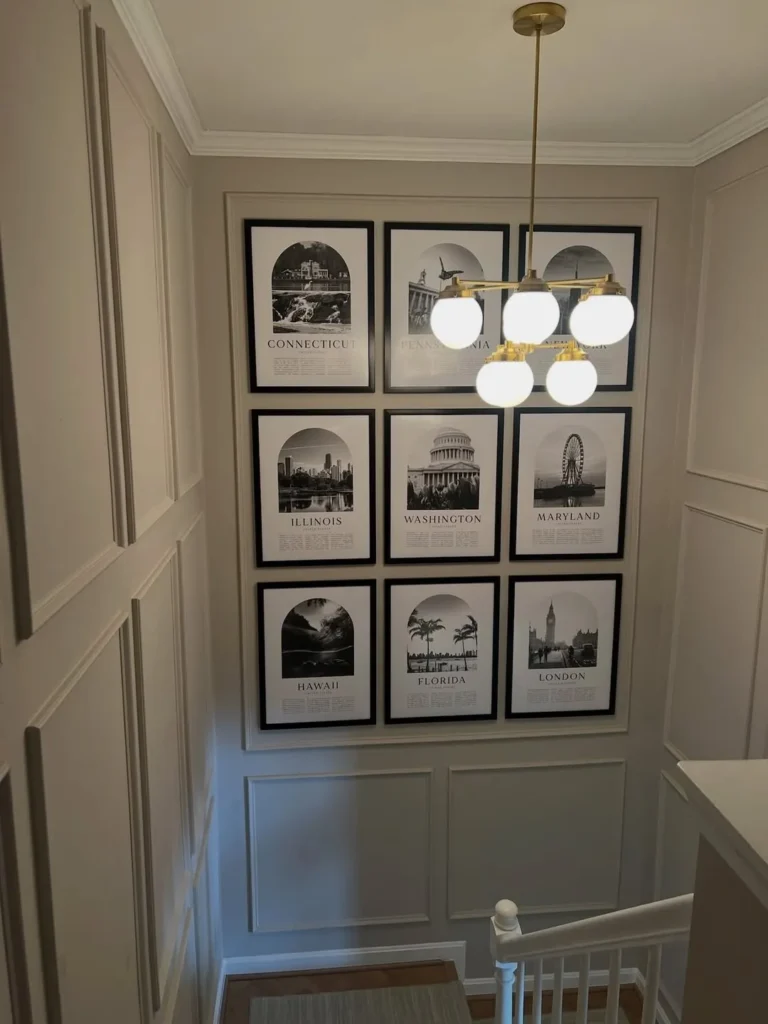
A stair landing becomes a strong feature when framed artwork sits inside moulding. The matching black frames create order, while neutral wall panels keep the display from looking scattered. The brass chandelier adds a soft glow, making the gallery feel collected rather than simply placed on a blank wall.
This layout is useful for family photos, travel prints, or black-and-white collections. Keep frame sizes consistent if the wall already has strong panel lines. When working near stairs, leave enough visual breathing room around the arrangement so the moulding and artwork can both be appreciated.
9. Gallery Wall Wainscoting With Picture Lights
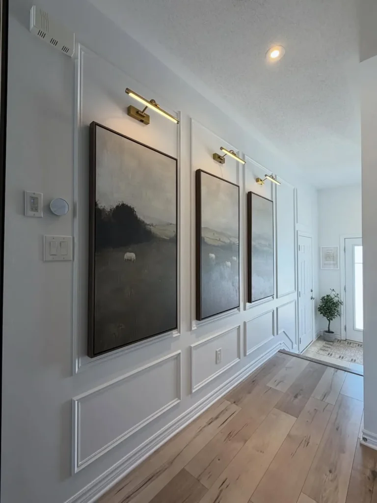
Picture lights make framed panels feel almost museum-like in a hallway. The large landscape artworks sit neatly within white moulding, while slim brass lights add warmth and focus. Pale wood flooring keeps the walkway bright, and the repeated spacing gives the long wall a calm, upscale rhythm.
For a similar effect, choose art that shares a colour palette or subject style. The lighting should be placed evenly so each frame feels intentional. This is a strong example of using wall panels as a guide, helping artwork look built-in instead of randomly hung.
10. Half Wall Wainscoting for a Bright Hallway
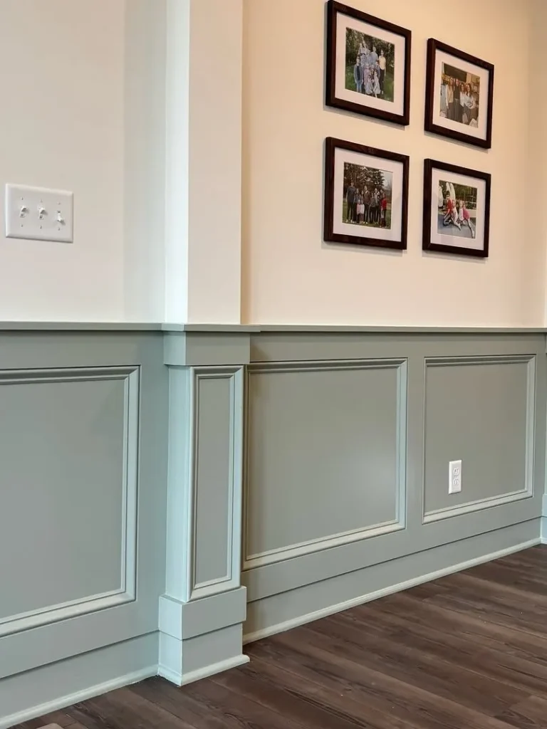
Half-wall panelling brings character to a hallway without overwhelming it. The soft green lower section adds colour and protection, while the white upper wall keeps the area open and bright. Framed family photos above the rail give the corridor a personal, lived-in feeling.
This style is practical for busy homes because the lower wall can handle more wear. Use a washable paint finish and repeat the same trim colour along corners for a clean transition. For Wainscoting Wall Panel Ideas with everyday value, this one adds charm, durability, and warmth together.
11. Half Wall Wainscoting With Natural Wood Trim
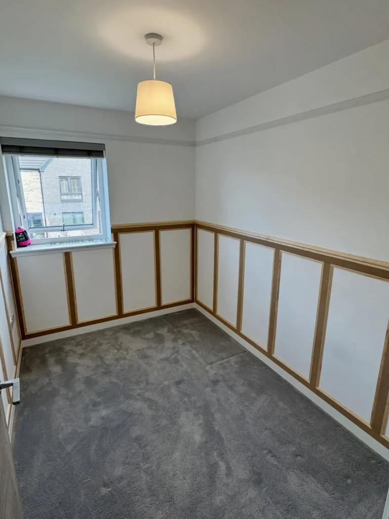
Natural wood trim gives half-wall panelling a warmer, more casual personality. The white panels keep the small room bright, while the honey-toned frame lines add contrast against the grey carpet, simple pendant light, and clean upper walls without making the layout feel crowded.
This works well in bedrooms, compact offices, or playrooms where full-height detailing might feel too formal. To copy the idea, keep the upper wall plain and let the wood trim define the lower half. Avoid adding too many wall pieces until furniture is in place.
12. Luxury Wainscoting With Gold Trim Accents
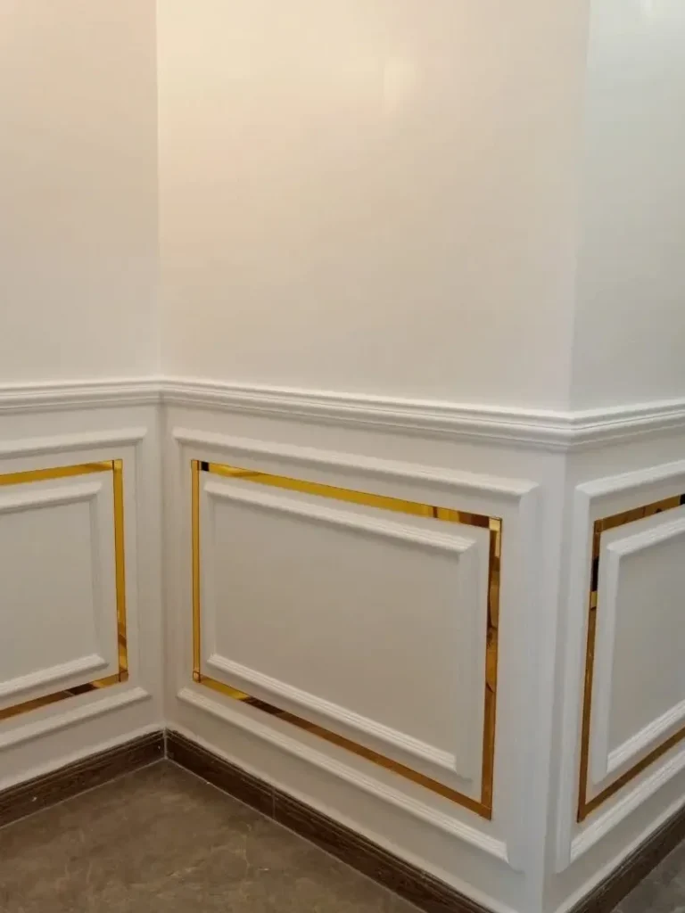
Gold trim can make simple white wall panels feel instantly more polished. The metallic border sits inside each moulded frame, adding shine without covering the whole wall. Paired with white paint and darker flooring, the detail feels elegant, crisp, and a little more glamorous.
For real homes, use gold accents carefully so the finish stays refined. Thin metallic strips work better than heavy decoration, especially in hallways, powder rooms, or formal entries. Keep nearby furniture simple, because the trim already brings enough visual interest to the lower wall.
13. Minimal Bedroom With Elegant Wall Panels
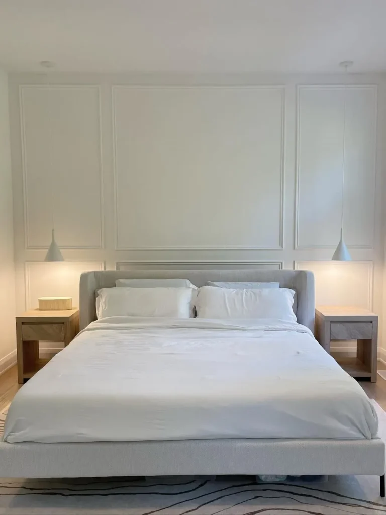
A quiet bedroom can still feel designed when the wall behind the bed has soft panel detail. The tall white moulding frames the headboard area, while matching bedside tables, pendant lights, and pale bedding keep the look peaceful rather than busy.
This is a smart choice for anyone who wants texture without strong colour. Let the panels replace a large headboard wall feature, then keep bedding clean and layered. Warm bedside lighting helps the trim show softly at night, giving the room a calmer, more finished feeling.
14. Minimal Picture Frame Moulding Feature Wall
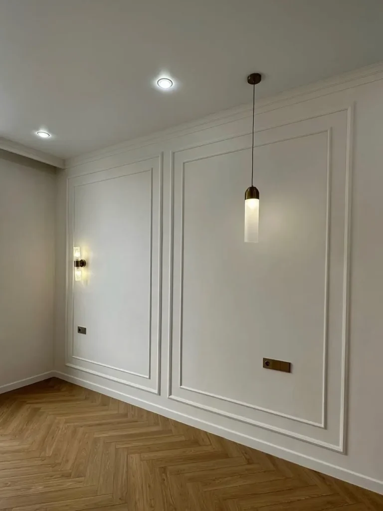
Picture frame moulding can create interest even before furniture enters the room. The white panels, herringbone wood floor, slim pendant, and wall sconce make the empty wall feel architectural rather than plain. Clean spacing keeps the design modern and easy to style later.
This approach is useful when a room needs structure but not a bold accent colour. Copy the balanced panel layout and leave enough open wall for art, a console, or seating. The trick is keeping the moulding proportionate so it feels intentional, not overbuilt.
15. Modern Box Moulding Dining Room Accent Wall
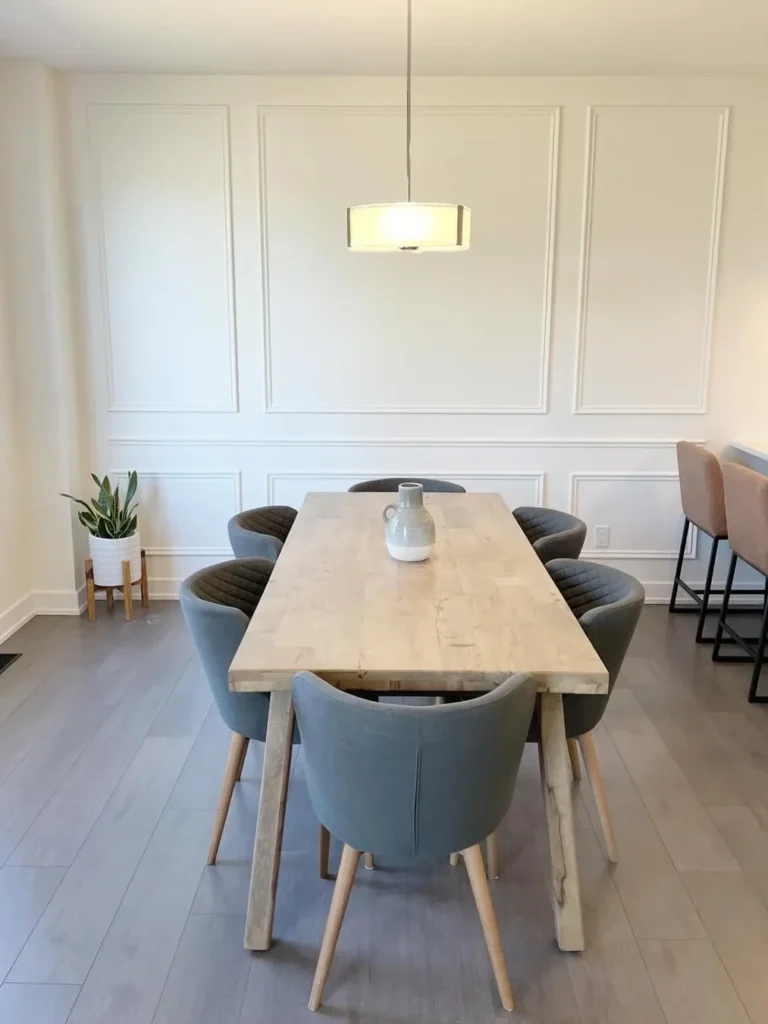
A dining room feels more complete when the wall behind the table has simple box moulding. The pale panels create a neat backdrop for the wood table, grey chairs, and central pendant light. Nothing feels loud, yet the room gains shape and visual rhythm.
This style works especially well in open-plan homes where dining areas need definition. Keep the panel colour close to the wall colour for a soft effect. A simple table centerpiece is enough here, because the wall already gives the room a finished editorial look.
16. Modern Picture Frame Wainscoting With Wall Sconces
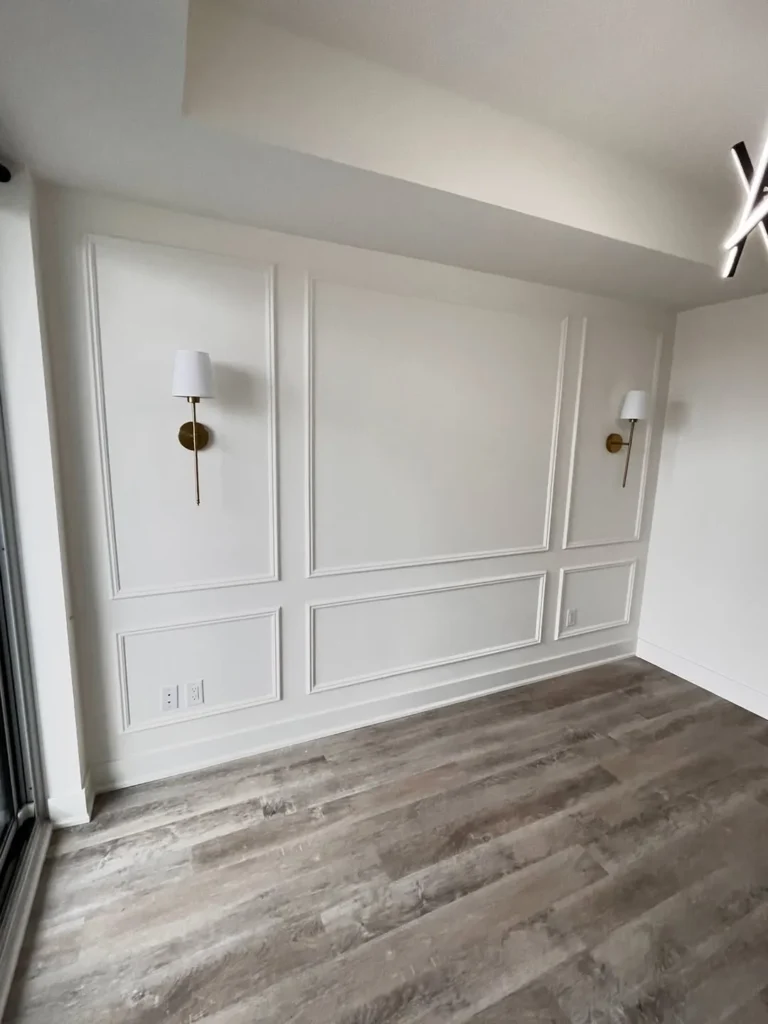
Wall sconces make picture frame moulding feel useful as well as decorative. The white panels create tall, clean sections, while slim brass-and-white lights add warmth and symmetry. Light wood flooring keeps the room soft, preventing the formal wall detail from feeling too stiff.
For a similar look, plan lighting placement before adding trim so everything aligns neatly. This idea suits bedrooms, dining rooms, and sitting areas where soft evening light matters. Keep artwork minimal or skip it completely if the sconces already create the right focal point.
17. Modern Slat Wall Mixed With Classic Moulding
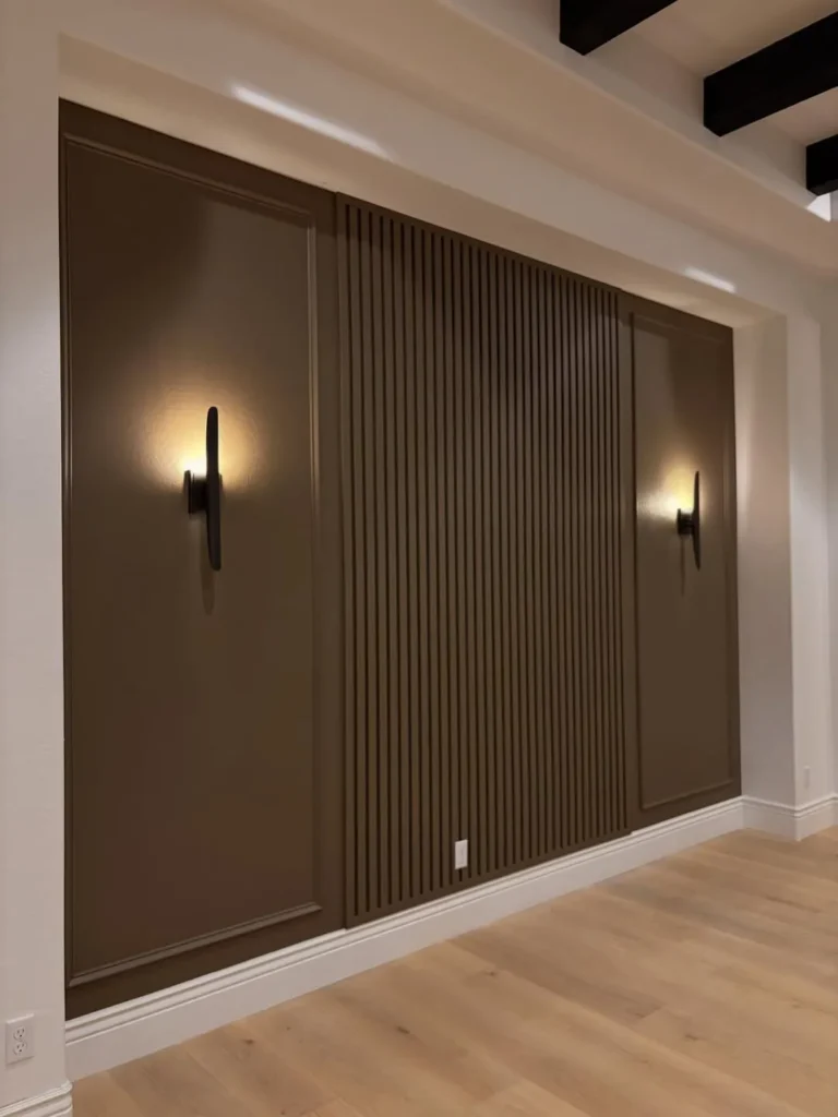
Mixing vertical slats with classic moulding gives one wall a strong modern edge. The brown panelled sections feel grounded, while the centre slat detail adds texture and height. Warm wall lights soften the darker colour and make the surface feel layered instead of flat.
This is a good choice for media walls, lounges, or dining areas that need a bold focal point. Keep surrounding walls lighter to balance the depth. If the slat section is busy, leave artwork off the wall so the material contrast can stand on its own.
18. Rich Chocolate Brown Wainscoting Living Room
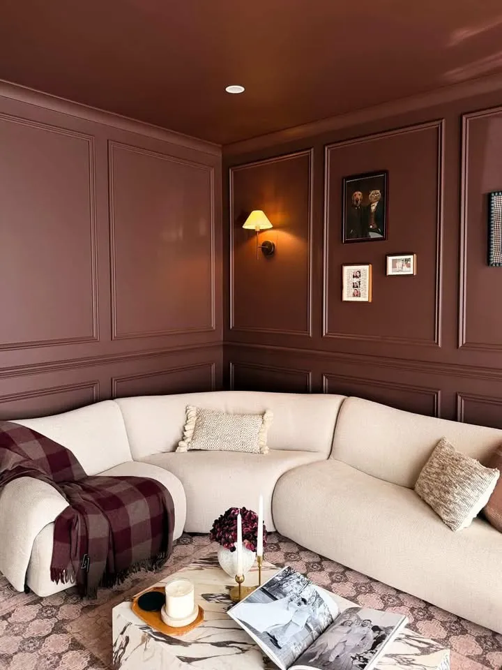
Chocolate brown panelling wraps this living area in warmth and depth. The matching ceiling, framed wall detail, soft cream sectional, patterned rug, and small picture arrangement create a cozy lounge that feels intimate without losing polish or comfort.
Dark colours work best when balanced with lighter furniture and warm lighting. Copy the tone-on-tone idea if you want a snug reading room or media corner, but avoid filling every panel with art. A few framed pieces and soft textiles are enough to keep the look inviting.
19. Sage Green Two-Tone Wainscoting Design
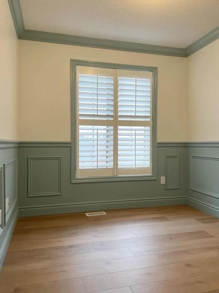
Sage green lower panelling brings gentle colour without overwhelming the room. The cream upper walls, matching green window trim, white shutters, and natural wood flooring create a soft two-tone look that feels fresh, calm, and easy to live with.
This is a practical option for bedrooms, breakfast corners, or small sitting rooms. Paint the lower half in a durable finish, then keep upper walls lighter for brightness. Repeating the green on trim makes the design feel connected, while the neutral top keeps everything airy.
20. Traditional Green Wainscoting With Vintage Decor
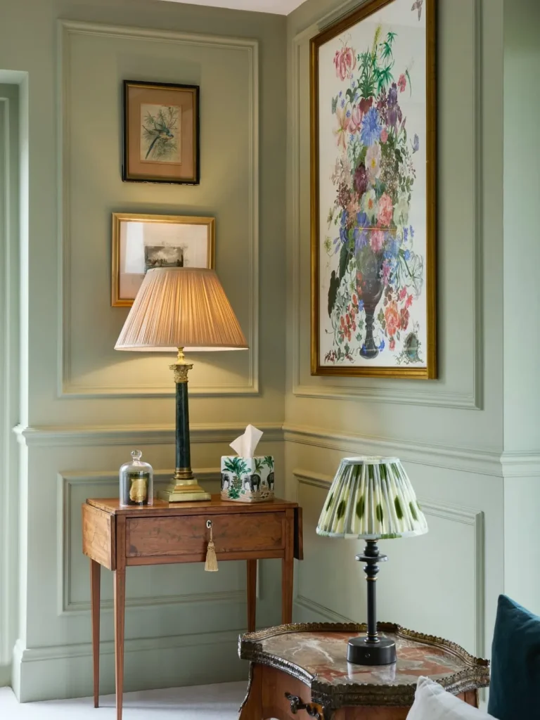
Traditional green panelling gives this corner a collected, old-world charm. The framed moulding, antique wood table, pleated lampshade, gold-framed art, floral print, and soft green walls work together without feeling overly matched. Every detail feels layered but still comfortable.
To recreate the mood, focus on muted paint, warm wood, and a few vintage-style accents. Let art sit inside or near the moulding so the panels act like quiet frames. This look suits reading corners, entry nooks, and rooms where character matters more than perfection.
21. Wallpaper and Wainscoting Hallway Combination
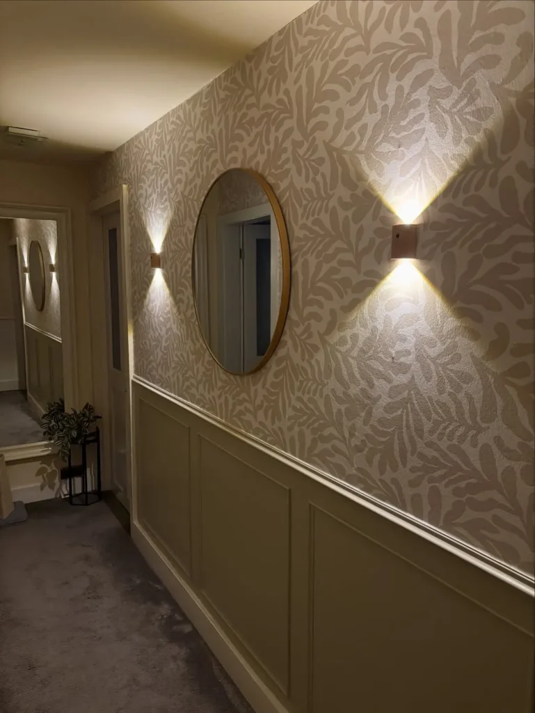
Patterned wallpaper above lower panelling gives a hallway instant personality without making it feel cramped. The leafy neutral print, soft olive wainscoting, slim chair rail, warm sconces, and round mirror all work together to create movement, light, and depth along the narrow wall.
This idea works well where a plain hallway needs charm but not heavy furniture. Keep the lower panels in a grounding colour, then choose wallpaper with a soft pattern rather than a loud contrast. Matching the sconces and mirror finish helps the whole wall feel planned and polished.
22. Warm Neutral Living Room With Classic Wainscoting
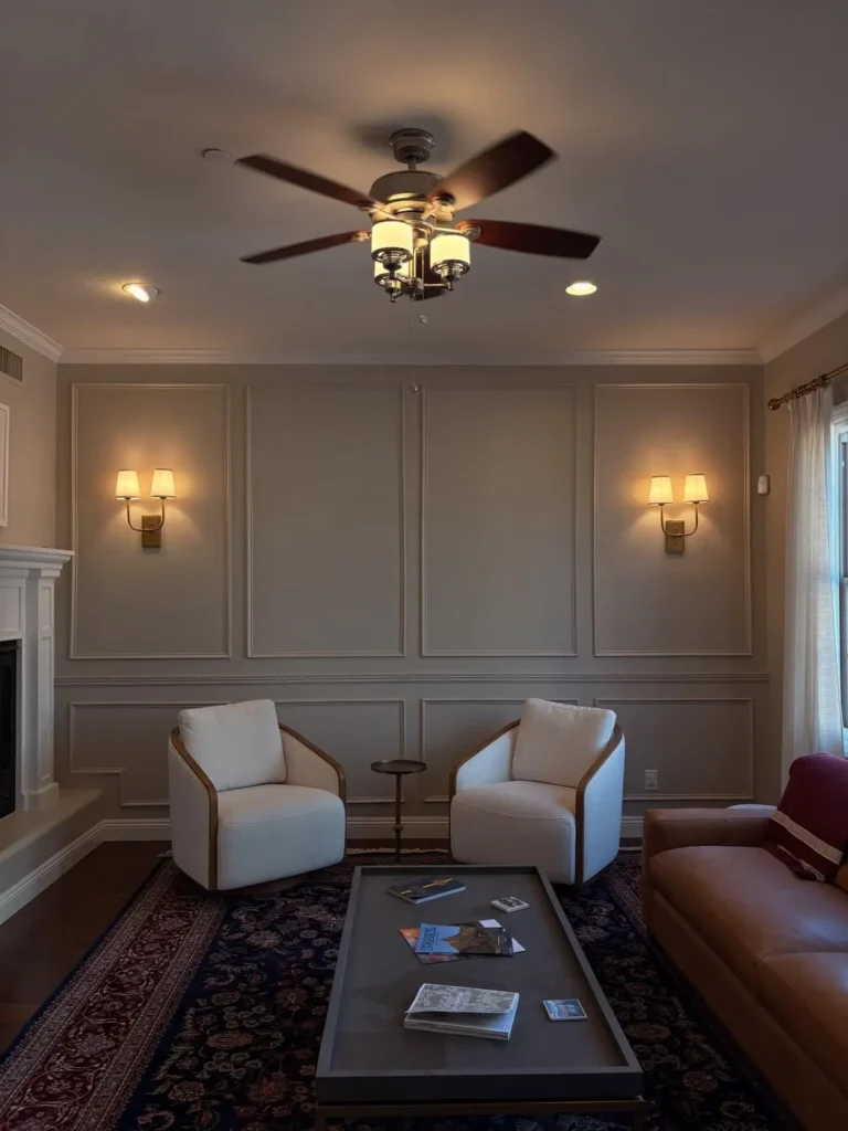
Warm grey-beige panelling makes this living room feel calm, layered, and quietly traditional. The tall picture-frame moulding, matching lower panels, wall sconces, white chairs, leather sofa, patterned rug, and ceiling fan create a comfortable sitting area with structure on every side.
For a real home, this look is easiest to copy by keeping the wall colour soft and letting lighting bring warmth. Use symmetrical panels behind seating, then add texture through rugs, leather, linen, or wood. Avoid overcrowding the panels with art so the moulding can stay elegant.
Practical Ways to Bring This Wall Detail Into Your Home
- Start with the mood you want, not the exact design. A soft, classic room may need simple white panels, while a cozy hallway can handle deeper paint, wallpaper, or warm sconces.
- Choose one clear focal point first. It could be a paneled dining wall, a hallway feature, or the wall behind a bed. Let that area lead instead of adding trim everywhere at once.
- Keep the base clean and simple. Neutral paint, tidy moulding lines, and balanced spacing usually look more expensive than overly busy designs.
- Add colour in smaller ways if you feel unsure. Try artwork, lamps, pillows, plants, or a darker lower panel before committing to a full dramatic wall.
- Think about daily use. In narrow halls, keep styling low and slim so the walkway stays open. In living rooms, avoid bulky arrangements that block conversation or make the panels feel crowded.
- For renters or small homes, try peel-and-stick moulding, removable wallpaper, or one accent section instead of a permanent full-room project.
- Repeat only a few colours and textures. Wood, brass, linen, black frames, or soft greenery can tie the look together without making the room feel overdecorated.
A beautiful wall upgrade does not need to feel complicated. With a simple plan and a few thoughtful details, it can feel polished, personal, and easy to live with.