20 Whole House Paint Color Ideas to Tie Rooms Together
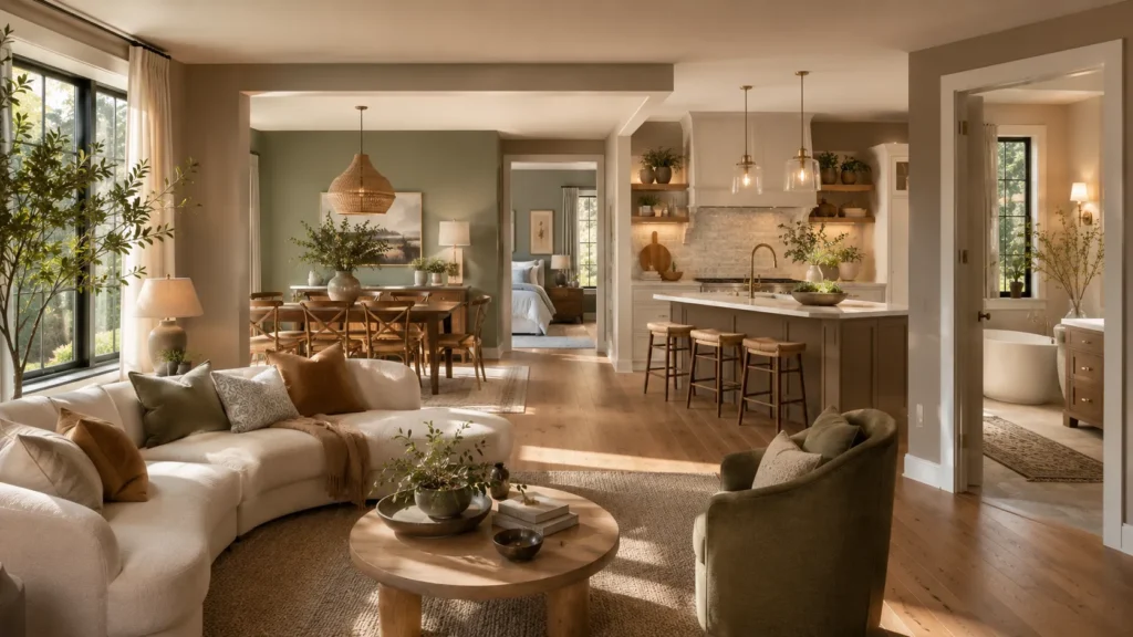
Choosing paint for one room is easy; building a palette that flows through an entire home is where things get tricky. These Whole House Paint Color Ideas will help you connect rooms without making every wall look identical. The goal is a home that feels coordinated, comfortable, and personal from one doorway to the next.
Inside, you’ll find soft neutrals, deeper statement shades, and practical color pairings that work with natural light, wood tones, and everyday furniture. In my experience, the best palettes repeat a few undertones rather than one exact color everywhere. That simple approach makes decorating easier, helps existing pieces feel more intentional, and gives each room enough freedom to have its own character.
1. Airy Blue Gray Paint Colors for Connected Rooms
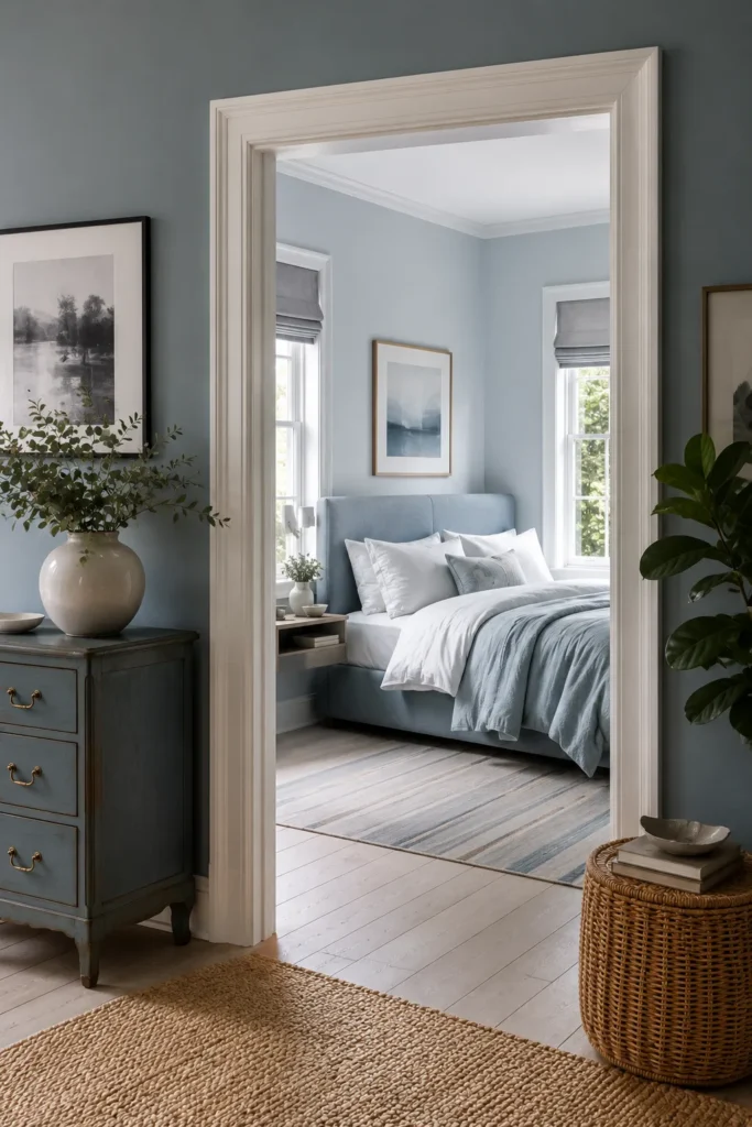
A soft blue-gray palette can make separate rooms feel quietly connected without forcing them to match. Here, the doorway frames a bedroom in a lighter version of the same cool family, while crisp white trim creates a clean transition and keeps both areas bright.
Carry one undertone through adjoining rooms, then vary the depth slightly so each area has its own identity. Natural wood, woven storage, pale flooring, and leafy greenery warm the cooler paint, preventing the scheme from feeling flat or overly formal in everyday use.
2. Classic Navy Blue Paint Ideas for Small Spaces
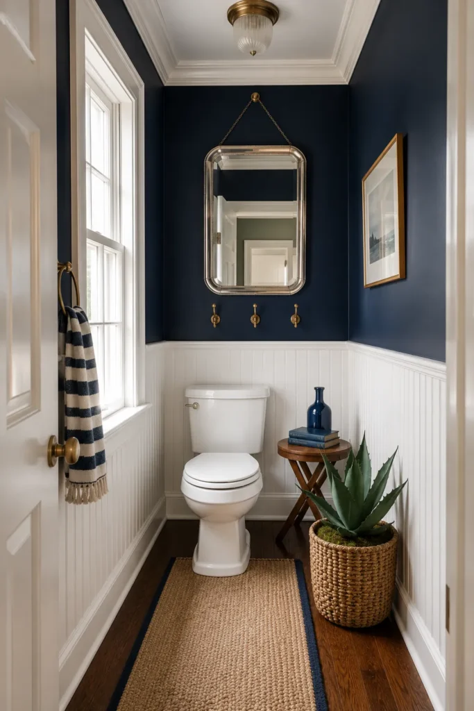
Small rooms can handle deep color when contrast is planned well. Navy walls give this narrow powder room a tailored, cocooning feel, while white beadboard, trim, and fixtures protect the lower half from looking heavy and visually widen the walkway.
Use dark paint above a durable white wall treatment for an easy balance of mood and practicality. Brass hooks, a bright window, and the reflective mirror add warmth and light, while one plant, a small table, and a striped towel keep the narrow floor plan from feeling crowded.
3. Deep Navy Walls With Timeless Dining Room Style
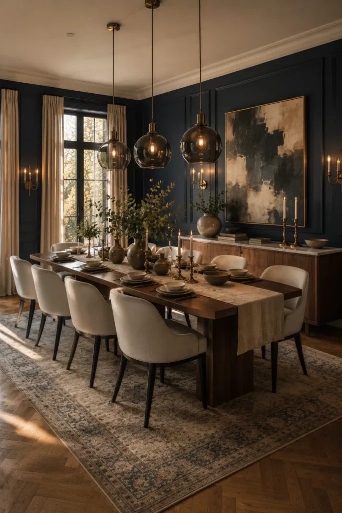
Deep navy turns a dining room into a polished gathering place, especially when sunlight and warm wood soften its intensity. Cream chairs, beige curtains, and a faded patterned rug create enough contrast for the long table to remain welcoming rather than overly dramatic.
For real homes, repeat navy on every wall but keep the ceiling, upholstery, and textiles light. A large neutral artwork, glass pendants, brass candleholders, and low greenery break up the dark surface while preserving comfortable views and conversation across the table.
4. Dramatic Black Whole House Paint Color Ideas
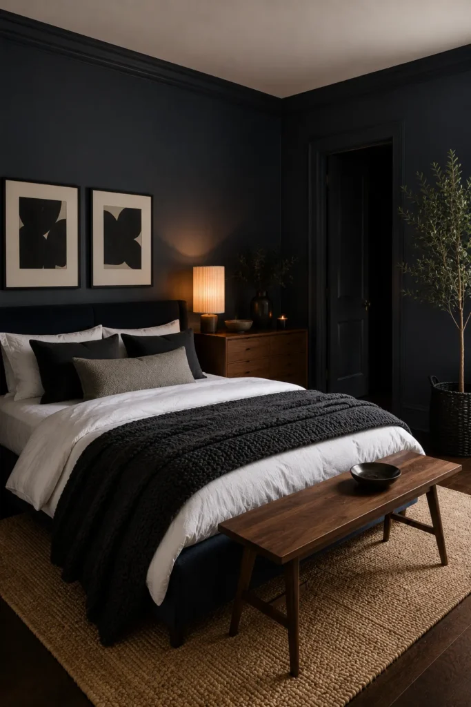
Black walls can feel surprisingly restful when the room relies on strong texture and simple contrast. White bedding lifts the dark envelope, while chunky charcoal layers, warm walnut furniture, woven flooring, and soft lamplight keep the bedroom grounded instead of stark.
A dramatic black scheme works best where natural or layered artificial light is available. Rather than adding many colors, repeat black through doors, cushions, and artwork, then introduce brown wood and tan fibers to make daily styling easier and visually calmer.
5. Dusty Blush Walls for a Soft Romantic Bedroom
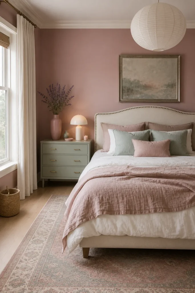
Dusty blush brings warmth to a bedroom without leaning too sweet or youthful. The muted pink walls sit comfortably beside sage furniture, soft white curtains, and pale upholstery, creating a gentle backdrop that feels romantic while still practical for everyday decorating.
Keep the pink slightly grayed, then repeat it through a quilt and two cushions instead of matching every item. Sage green, natural baskets, light wood, and one calm landscape provide enough contrast and focus without turning the room sugary or overly themed.
6. Forest Green Bedroom With Rich Earthy Tones
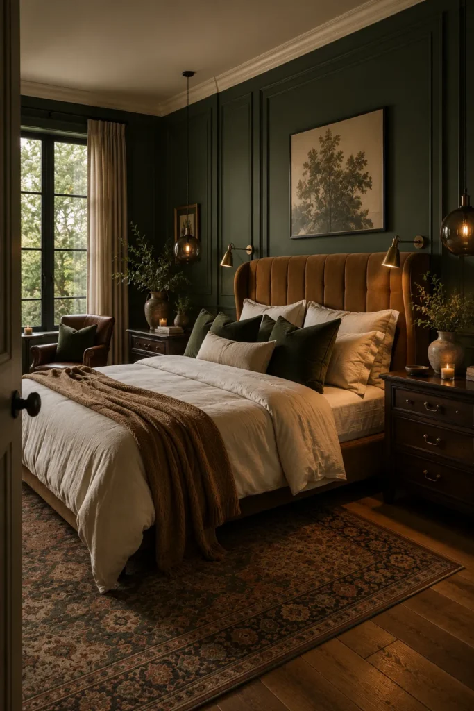
Forest green creates an intimate bedroom that still feels connected to nature. Warm caramel velvet, cream bedding, dark wood furniture, and leafy branches balance the deep walls, while pendant lights and bedside reading lamps add useful pools of light around the bed.
Use the same green across walls and molding for a seamless architectural finish, then break it up with light bedding and muted artwork. In smaller rooms, limit dark furniture to essential pieces and keep window treatments pale so daylight can soften the richer paint.
7. Industrial Loft Paint Colors With Urban Character
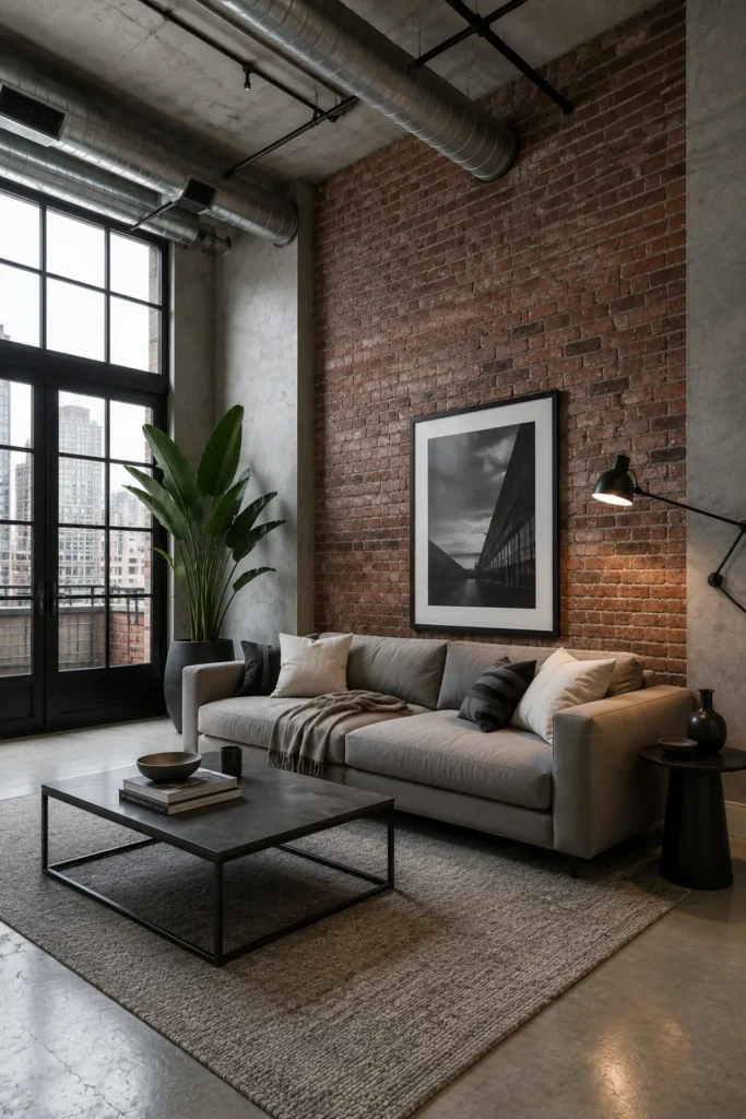
Industrial rooms look more inviting when raw finishes are balanced with soft neutrals. Exposed brick, concrete, metal ductwork, and black window frames provide strong urban character, while a generous gray sofa and textured rug create a comfortable center for daily living.
Let brick act as the main color rather than introducing several competing paint shades. Warm gray walls, black metal, charcoal accessories, oversized artwork, and one large plant support the tall scale while softening hard surfaces and keeping the open floor plan uncluttered.
8. Jewel Tone Paint Colors for Bold Living Rooms
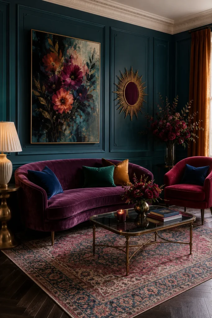
Jewel tones bring instant depth when each color is repeated with intention. Teal paneled walls form a rich backdrop for plum velvet seating, burgundy flowers, navy cushions, and touches of mustard, creating a layered room that feels collected rather than randomly colorful.
Choose one dark wall color as the anchor, then limit accents to three related jewel shades. Brass tables, a gold mirror, warm curtains, and simple furniture shapes help the saturated palette feel balanced, polished, and comfortable instead of visually busy.
9. Light Coastal Blue Paint Colors for Relaxed Homes

A pale coastal blue can visually link a bedroom to the view beyond it. Aqua walls and bedding echo the water, while white paneling, sheer curtains, wicker furniture, and a natural rug keep the room airy, casual, and easy to maintain.
For a relaxed whole-home scheme, use this soft blue in bedrooms or connecting areas, then carry white trim and woven textures nearby. Avoid obvious nautical accessories; plants, coastal artwork, and natural wood suggest the setting more subtly and give the look longer-lasting appeal.
10. Mushroom Brown Whole House Paint Color Ideas
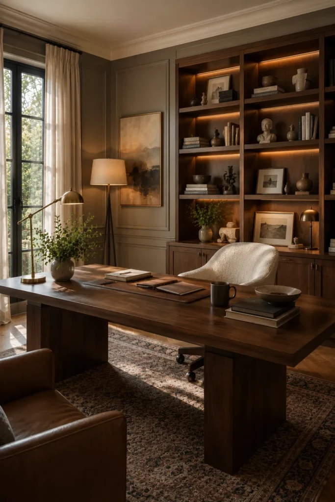
Mushroom brown gives a home office warmth without making it feel dark or dated. The taupe-brown walls sit naturally beside walnut shelving, a substantial wood desk, leather seating, and a traditional rug, producing a focused setting with enough softness for long workdays.
Mushroom brown is especially useful when adjoining rooms contain several different wood tones. Choose balanced gray undertones, then repeat cream, bronze, and dark brown through lighting and accessories while integrated shelf lights prevent the built-ins from disappearing into the surrounding color.
11. Olive Green Whole House Paint Ideas
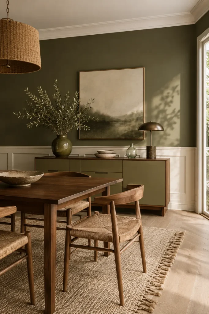
Olive green gives a dining room calm depth without making it feel closed in. Here, the earthy walls, matching sideboard, warm walnut table, woven chairs, and cream paneling create a balanced palette that feels natural, settled, and easy to live with.
For a connected home, repeat olive through one cabinet, artwork, or nearby textiles rather than painting every room identically. Keep ceilings and lower wall trim light, then add flax-colored rugs, branches, and warm wood so the green reads soft and welcoming throughout the day.
12. Rich Brown Walls for a Cozy Traditional Living Room
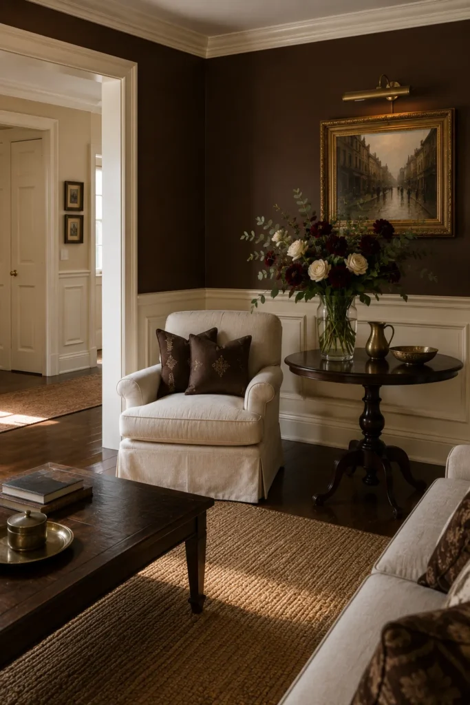
Rich brown walls make this sitting area feel intimate, traditional, and quietly polished. Cream wainscoting and upholstery prevent the darker upper walls from overwhelming the room, while antique-style artwork, brass accents, dark wood furniture, and deep burgundy flowers reinforce the warm, collected mood.
Use this approach in libraries, formal living rooms, or passage areas where you want stronger character. A crisp pale trim color is essential, and nearby rooms can shift to lighter tan or ivory while repeating the same wood tones and aged metal finishes for continuity.
13. Soft Blue Walls for a Calm Coastal Bedroom
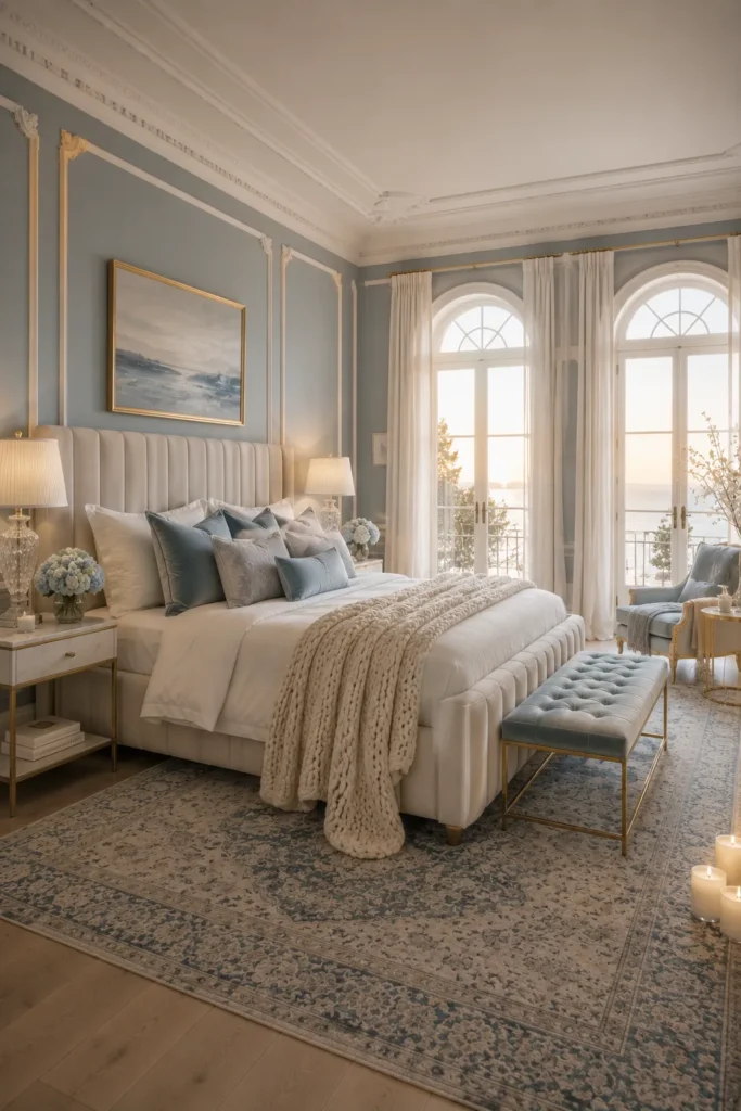
Soft blue turns a bright bedroom into a calm retreat that feels open rather than chilly. White molding, an upholstered bed, sheer curtains, crystal lamps, pale blue textiles, and a patterned rug create gentle layers while the arched windows keep the color luminous.
Choose a blue with a muted gray undertone, especially in rooms receiving strong daylight. Carry it into adjoining spaces through artwork, cushions, or painted furniture, then use warm brass and creamy whites to soften the scheme and stop the overall home from feeling overly coastal.
14. Soft Gray Paint Colors with Blush Accents
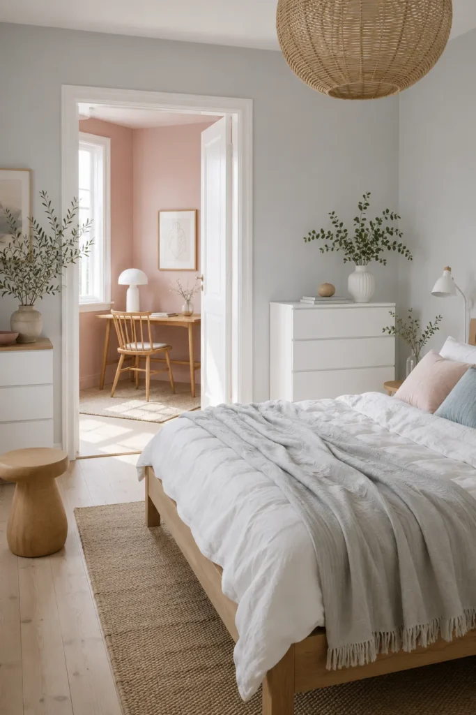
Soft gray creates a useful bridge between a pale bedroom and the blush workspace beyond it. White furniture, natural wood, woven lighting, muted greenery, and gentle pink accents keep both rooms airy while still giving each area a clear purpose and personality.
This kind of neutral works well for open doorways because it allows nearby accent colors to change without creating a sharp break. Keep the flooring and trim consistent, then repeat blush in just two or three small details so the transition feels planned rather than overly matched.
15. Sunny Yellow Accent Wall for a Bright Family Space
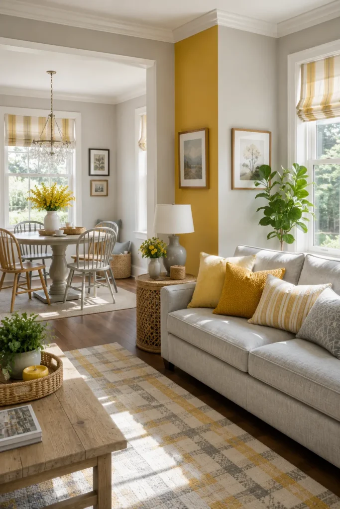
A sunny yellow accent wall can wake up a neutral family room without taking over the entire floor plan. Soft gray walls, white trim, pale upholstery, woven tables, striped shades, green plants, and mustard cushions spread the warmth across both living and dining areas.
Reserve the strongest yellow for one narrow architectural section, then echo it through flowers, pillows, and window fabric. This keeps repainting manageable and gives you flexibility later, while the gray background continues to connect rooms even when seasonal accessories or furniture change.
16. Teal and Terracotta Paint Colors That Flow Together
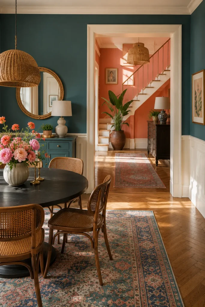
Teal and terracotta create a lively transition between rooms because both colors share warm, earthy energy. Deep teal grounds the dining area, while coral walls brighten the hall, and white trim frames the doorway so each color remains distinct instead of competing.
Repeat natural cane, dark wood, greenery, and patterned rugs on both sides of the opening to link the palette. When using two strong shades, avoid adding another dominant color; let artwork, flowers, and textiles borrow from teal, coral, cream, and warm brown only.
17. Warm Beige Paint With Soft Layered Textures
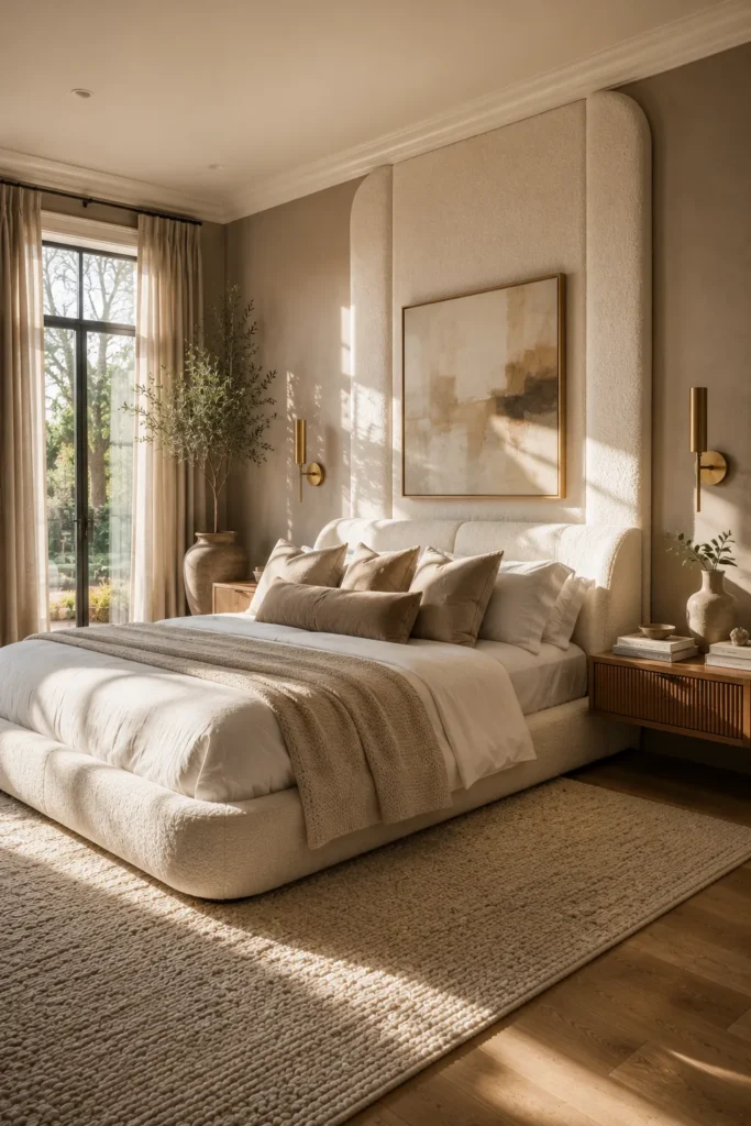
Warm beige feels especially inviting when the room relies on texture instead of heavy contrast. A rounded upholstered bed, tall padded wall panels, soft bedding, a nubby rug, warm wood nightstands, and slim brass sconces give the neutral palette depth without visual clutter.
For an easy whole-home flow, keep beige walls consistent and vary texture from room to room. Bouclé, linen, brushed metal, pale oak, and woven rugs can make each area feel individual while preserving a quiet backdrop that works with changing furniture and accessories.
18. Warm Greige Paint for a Relaxed Bedroom Retreat
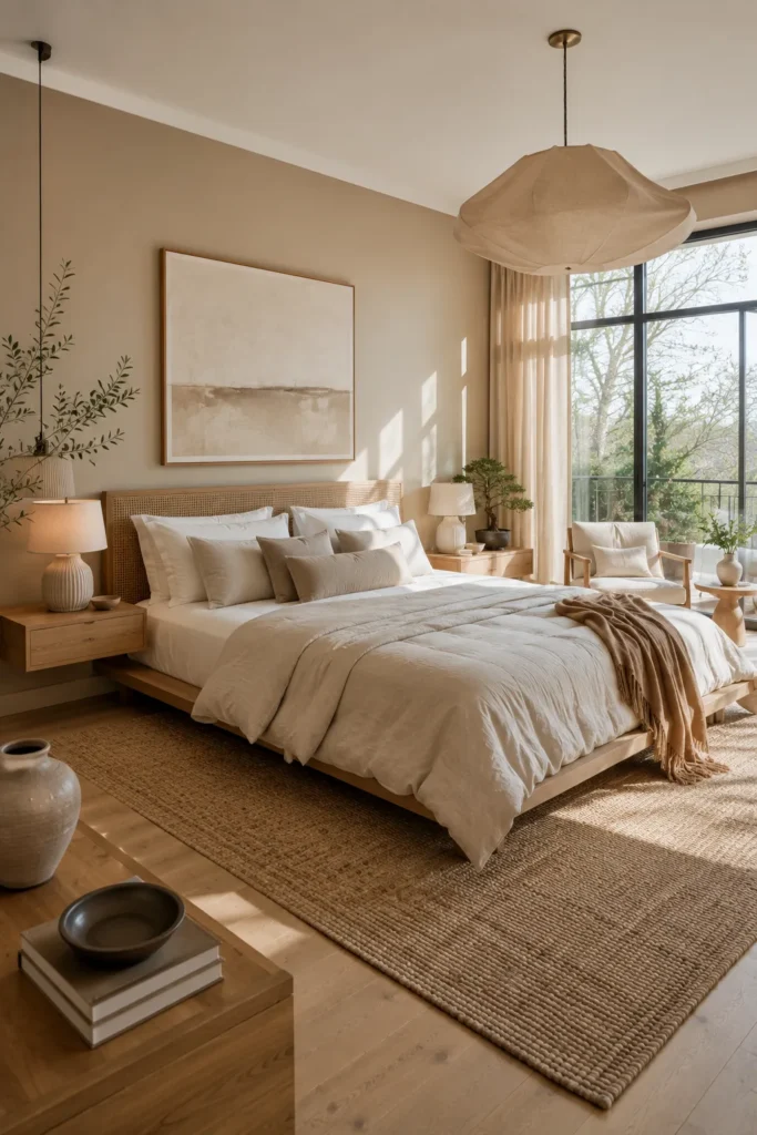
Warm greige gives this bedroom a relaxed, tailored look that still feels soft in morning light. Cream bedding, taupe cushions, a textured headboard wall, pale wood furniture, neutral pottery, and filtered sunlight create a restful palette with enough contrast to avoid looking flat.
Test greige beside your flooring and curtains before committing, since undertones shift throughout the day. Once chosen, repeat the same shade in hallways or connecting rooms, then use cream, sand, and light walnut as dependable supporting colors for a calm, practical result.
19. Warm Taupe Paint Colors for Cozy Living Spaces
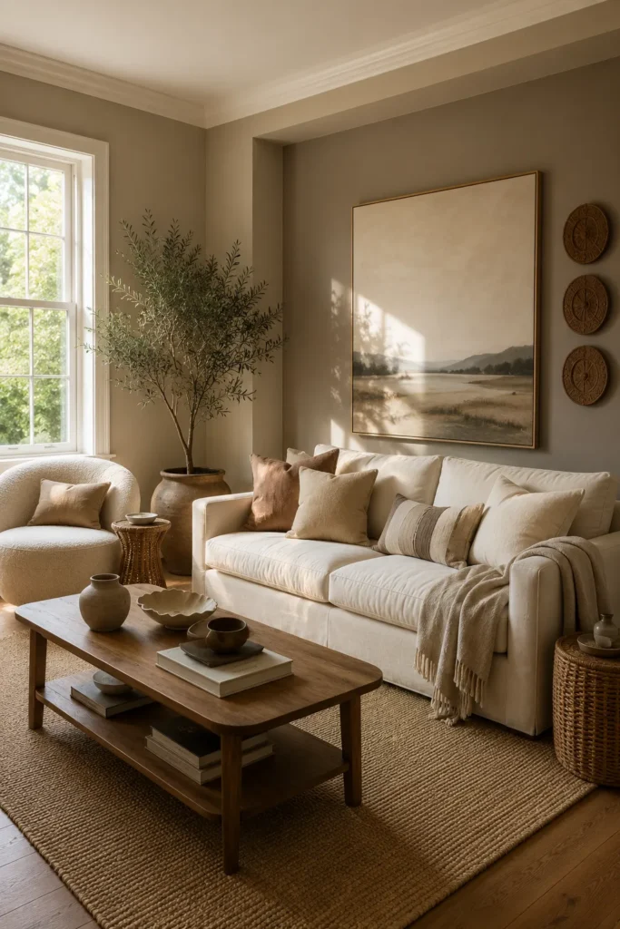
Warm taupe makes a living room feel grounded while allowing light upholstery and natural materials to stand out. A cream sofa, curved chair, olive tree, wood coffee table, woven rug, and quiet landscape artwork create a soft, earthy arrangement suited to everyday use.
This shade is useful in busy shared areas because it hides minor marks better than bright white yet still reflects daylight. Keep accessories within tan, oatmeal, muted brown, and soft green, and leave enough open wall space so the room feels comfortable rather than overstyled.
20. Warm Terracotta Whole House Paint Inspiration
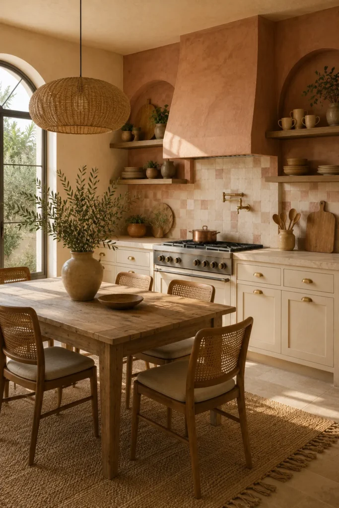
Terracotta brings sun-baked warmth to this kitchen without sacrificing brightness. The plastered hood and surrounding arches create a strong focal point, while cream cabinetry, handmade-look tile, natural wood, cane chairs, brass hardware, and woven lighting keep the palette relaxed and approachable.
Use terracotta on one architectural feature or connected dining wall instead of every surface, especially in smaller homes. Carry it through clay pots, cushions, art, or table linens, then balance the color with warm white, sand, and wood so nearby rooms remain cohesive and easy to update.
Simple Ways to Build a Color Palette That Feels Like Home
- Start with the mood, not an exact room copy. Decide whether you want your home to feel calm, warm, airy, or dramatic, then choose colors that support that feeling in your own lighting and layout.
- Create one clear focal point. A painted fireplace, feature wall, kitchen island, or hallway can carry the strongest shade while surrounding rooms stay quieter.
- Keep the main foundation simple. Soft white, warm beige, greige, or muted gray can connect busy areas and make transitions between rooms feel smoother.
- Introduce stronger color in smaller amounts. Cushions, artwork, curtains, lamps, and painted furniture are practical ways to test a shade before using it across an entire room.
- Repeat a limited palette. Choose two or three main colors, then echo them through textiles, wood finishes, metals, and accessories for a coordinated result.
- Consider how rooms look through open doorways. Nearby colors do not need to match, but their undertones should feel comfortable together when seen at the same time.
- Use removable solutions when needed. Renters and small-space homeowners can try peel-and-stick panels, framed fabric, removable wallpaper, or painted freestanding furniture.
- Leave room for the home to breathe. Too many bold shades can compete, so balance rich colors with simple walls, uncluttered surfaces, and natural textures.
A beautiful whole-home palette does not need to follow every trend. A few thoughtful colors, repeated with care, can make each room feel personal, connected, and easy to enjoy every day.