
25 Bedroom Color Schemes That Make Your Room Glow
Bedroom Color Schemes can completely change the way your room looks and feels. The right mix of shades can make a space feel brighter, calmer, warmer, and far more beautiful without needing a full makeover.
If your bedroom feels dull, too plain, too dark, or simply missing that soft glow you keep saving on Pinterest, this guide is here to inspire you. It brings together color combinations that help your room feel more polished, more personal, and more inviting in real everyday life. In my experience, the right palette does more than improve the walls or bedding. It changes the whole mood of the space. That is why these ideas focus on color pairings that are not only beautiful to look at, but also easy to imagine, style, and live with.
1. Warm White And Beige
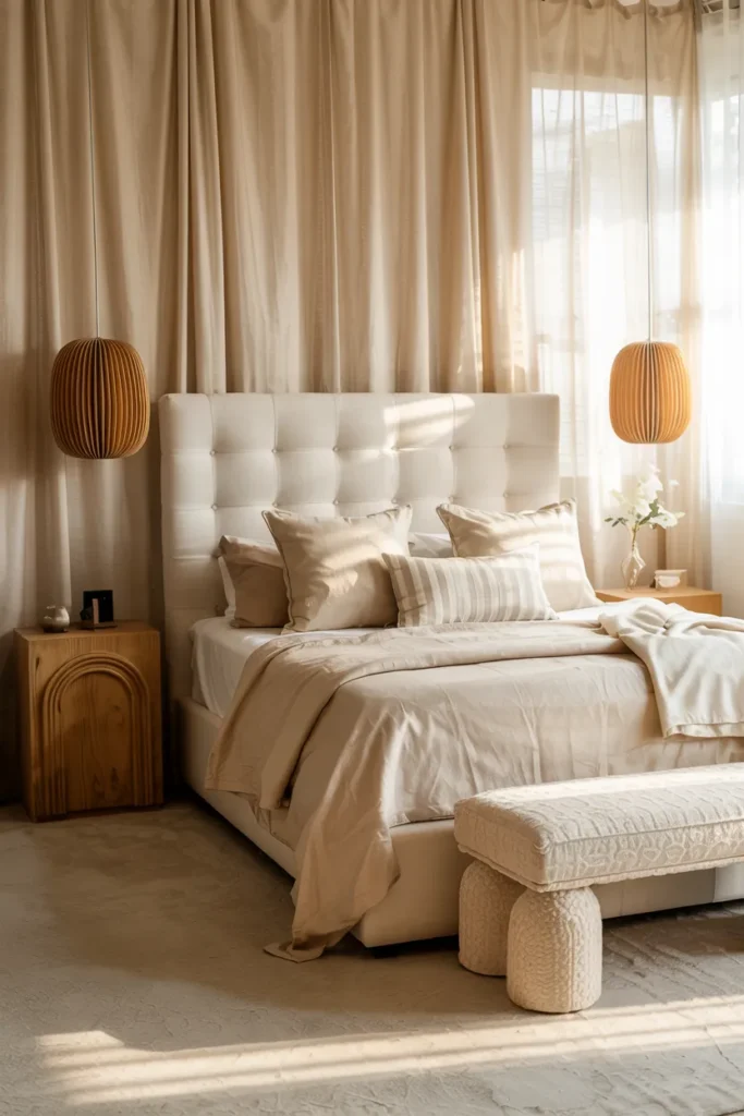
- Makes the room feel brighter, softer, and more expensive
- Creates a glowing backdrop that works with many decor styles
- Lets texture become the star instead of loud contrast
- Helps smaller bedrooms feel airy and visually calm
Nothing feels more instantly calming than a bedroom wrapped in warm white and beige. This pairing works because it reflects light beautifully while still keeping the space soft and welcoming. Instead of looking stark or flat, the room feels creamy, airy, and comfortable from the first glance. I’ve noticed this is one of the easiest ways to make a bedroom feel more expensive without making it complicated. When walls, bedding, and curtains stay in the same warm family, the whole space starts to glow in a very natural way that feels restful and timeless.
This palette also works especially well in real homes because it gives you freedom to layer texture without visual noise. Linen bedding, woven accents, upholstered furniture, and light wood all stand out more when the colors stay gentle and connected. In my experience, this kind of setup helps a room feel cleaner and calmer even when the layout is simple. That is why many designers recommend soft neutrals for spaces meant for rest. Visually, the bedroom feels larger and lighter. Functionally, it becomes easier to style, refresh, and keep looking polished every day.
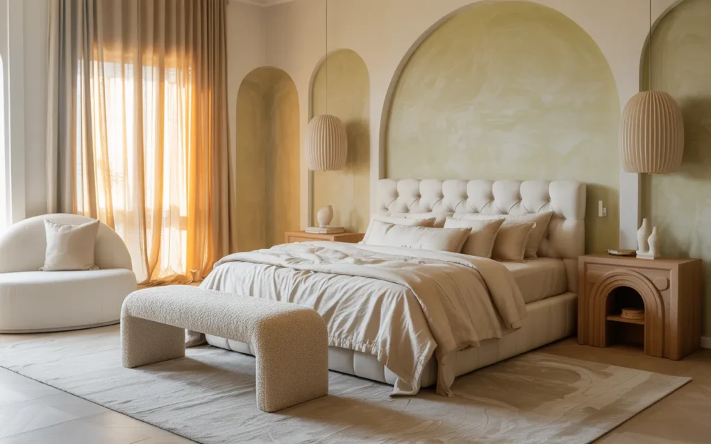
2. Sage And Cream
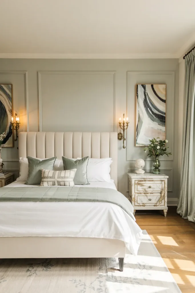
- Brings in color without making the room feel loud
- Creates a fresh but grounded mood that still feels restful
- Pairs beautifully with brass, wood, and soft neutrals
- Gives the bedroom a more styled and custom look
A sage and cream palette can make a bedroom feel soft, grounded, and quietly beautiful in a way that never feels forced. The muted green adds just enough color to keep the room from looking plain, while cream keeps everything light and balanced. Together, they create a peaceful atmosphere that feels both fresh and comforting. I’ve seen this work well in many homes because it adds personality without becoming too trendy or hard to live with. The result is a bedroom that feels gentle, inviting, and perfectly suited to slow mornings and restful evenings.
This pairing also works because it blends so naturally with materials people already love in bedrooms. Warm wood furniture, brass lighting, off-white curtains, and textured bedding all look richer when placed against soft green and cream tones. In my experience, sage is especially helpful when a room needs more life but still needs to feel calm. That subtle color shift can completely change the mood. Visually, the space feels more layered and organic. Functionally, it stays easy to decorate around, which makes refreshing the room much simpler over time.
3. Dusty Rose And Taupe

- Adds warmth and softness without feeling childish
- Makes the room look more romantic and polished
- Brings in gentle color while keeping the space restful
- Works beautifully with gold, glass, and soft wood tones
A dusty rose and taupe bedroom can feel instantly softer, warmer, and more refined without losing that calm sleeping-space mood. The blush tone adds a gentle glow, while taupe keeps everything grounded and grown-up. This balance is what makes the palette so appealing. Instead of feeling overly feminine or overly plain, the room lands somewhere elegant and relaxed. I’ve noticed this combination works especially well when people want a little color but still want the space to feel restful. The overall look feels polished, inviting, and full of subtle warmth from wall to bedding.
This color pairing also photographs beautifully because it layers soft tones that reflect light in a flattering way. Taupe walls or upholstery can support the rose accents without making the room feel busy, and small metallic details add even more glow. In my experience, this is one of those Bedroom Color Schemes that makes a room feel more styled almost immediately. That is why many designers recommend muted pinks over brighter shades for sleep spaces. Visually, the room feels elegant and cozy. Functionally, it stays easy to update with neutral decor and seasonal textures.
4. Soft Gray And White
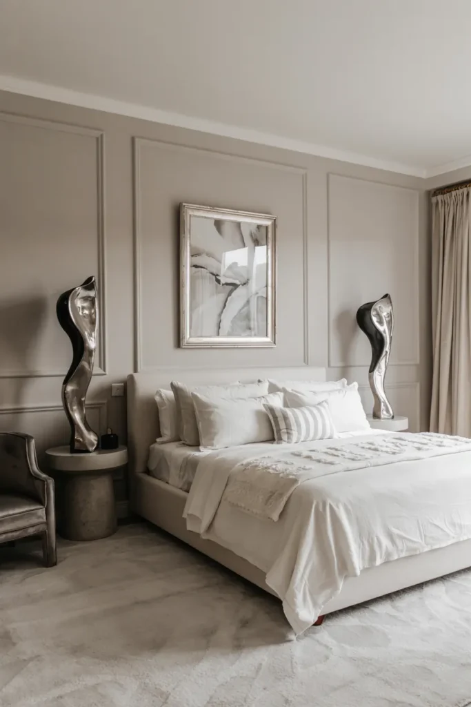
- Makes the room feel fresh, bright, and quietly elegant
- Adds contrast without making the space feel harsh
- Helps sculptural furniture and layered textures stand out
- Works beautifully for both modern and classic interiors
A soft gray and white palette can make a bedroom feel instantly cleaner and more peaceful without looking flat. The gray adds just enough contrast to define the space, while white keeps everything bright and open. Together, they create a calm backdrop that feels timeless and easy to live with. I’ve noticed this pairing works especially well in bedrooms that get good natural light because the tones shift beautifully throughout the day. The room starts to feel fresher, more organized, and quietly elegant, which is exactly what many people want from a restful personal space.
This combination also works because it leaves plenty of room for texture to do the heavy lifting. Knit throws, linen bedding, soft rugs, and upholstered furniture all look richer when the colors stay simple and balanced. In my experience, light gray is one of the easiest shades to style because it can lean warm or cool depending on the decor around it. That is why many designers recommend it for people who want flexibility. Visually, the bedroom feels brighter and more structured. Functionally, the palette stays easy to refresh without needing major changes.
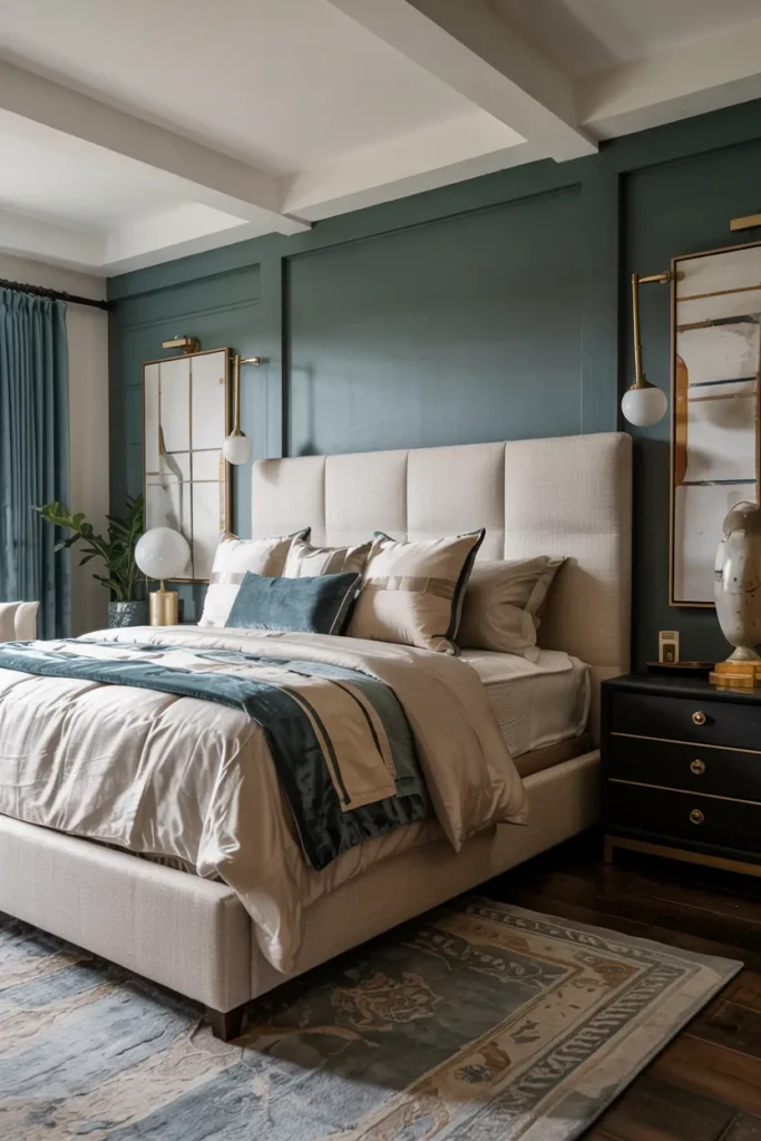
5. Navy And Ivory
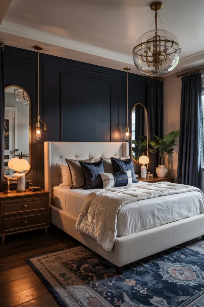
- Brings depth and drama while still feeling restful
- Makes lighter bedding and decor glow against darker tones
- Creates a more grounded and elevated atmosphere
- Adds instant richness to plain or oversized bedrooms
A navy and ivory bedroom can feel rich and glowing at the same time, which is part of what makes this pairing so effective. The deep blue adds depth and a sense of calm, while ivory keeps the room from feeling too dark or heavy. When used well, the contrast feels classic rather than sharp. I’ve seen this work especially well in bedrooms that need more presence because navy helps anchor the space in a very elegant way. The result feels cozy, elevated, and much more layered than a room filled only with pale neutral tones.
This palette also works because it gives you a strong visual structure without needing too many extra details. Ivory bedding pops against a navy wall, warm metals look richer, and natural wood feels more grounded. In my experience, this combination is especially effective when the room needs a slightly more sophisticated mood without becoming formal. That is why many designers recommend darker accent colors paired with soft light neutrals. Visually, the room gains contrast and warmth. Functionally, it still feels restful, making it a smart choice for bedrooms that need both drama and comfort.
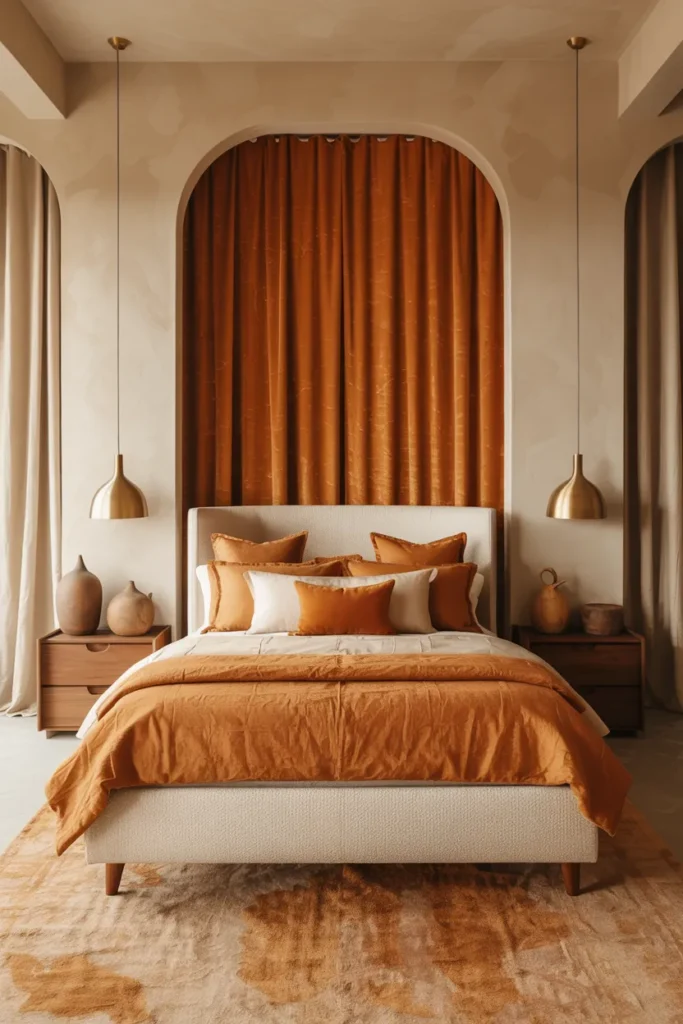
6. Terracotta And Sand
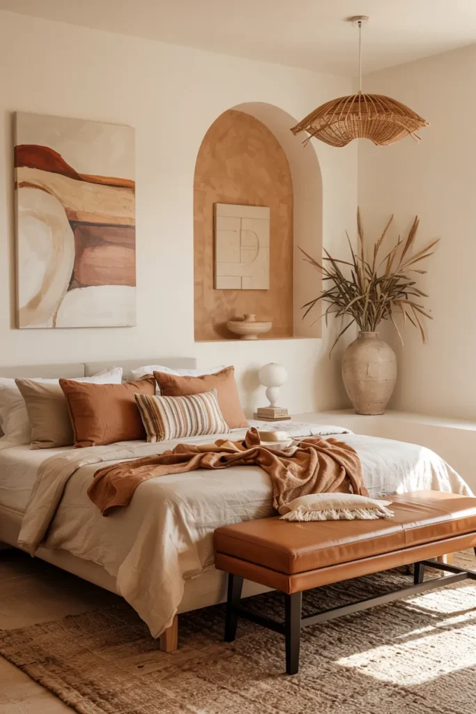
- Adds a warm earthy glow without feeling overpowering
- Makes the bedroom feel more welcoming and layered
- Pairs naturally with wood, leather, and woven textures
- Brings personality into spaces that feel cold or plain
Terracotta and sand can make a bedroom feel instantly warmer, as if the whole space is holding onto the last light of the day. The soft clay tone brings color and personality, while sand keeps the room balanced and airy. This pairing feels earthy, cozy, and full of quiet character. I’ve noticed it works especially well in rooms that feel cold or visually plain, because these tones add glow without becoming too bold. The overall effect is welcoming and relaxed, with a natural warmth that makes the room feel more intimate and beautifully lived in.
This color pairing also works because it connects so naturally with everyday materials like linen, oak, wicker, and warm metals. In my experience, terracotta accents do not need to appear everywhere to make an impact. Even a throw, cushion, or painted wall can shift the whole mood. That is why many designers recommend earthy tones when a bedroom needs more personality without losing calm. Visually, the space feels richer and more textured. Functionally, the palette stays easy to style around, which helps the room remain cohesive and comfortable through seasonal decor changes.
7. Olive And Camel

- Creates a richer earth-tone look that feels grounded and elevated
- Adds warmth without relying on bright or sugary color
- Makes neutral rooms feel deeper and more designer styled
- Works beautifully with brass, walnut, and textured fabrics
An olive and camel palette can make a bedroom feel instantly richer, warmer, and more polished without becoming too dark. Olive brings a grounded, natural depth, while camel adds softness and warmth that keeps the room inviting. Together, they create a balanced look that feels earthy but still refined. I’ve noticed this pairing works especially well when a bedroom needs more character without losing that calm, restful mood. The space starts to feel more layered and intentional, with a glow that comes from warm undertones rather than bright contrast or heavy decoration.
This color story also works beautifully because it blends with materials that already feel luxe and comforting in real homes. Walnut wood, brushed brass, woven textures, and soft upholstery all look more elevated beside olive and camel tones. In my experience, these shades help a bedroom feel more custom because they are less expected than standard beige or gray. That is why many designers recommend earthy combinations when a room needs a quiet personality. Visually, the bedroom gains depth and warmth. Functionally, the palette stays flexible enough for seasonal styling and easy decor updates.
8. Lavender And Cream
- Adds a soft dreamy tone without making the room feel childish
- Creates a fresh and calming atmosphere with gentle color
- Brightens the bedroom while still feeling cozy
- Looks beautiful with cream, gold, silver, and soft wood finishes
Lavender and cream can make a bedroom feel light, fresh, and softly romantic in a way that still feels mature. The lavender adds gentle personality, while cream keeps the space balanced and airy. Together, they create a glow that feels peaceful rather than playful. I’ve seen this work well in bedrooms that need more color but still want to hold onto a restful mood. The room starts to feel more delicate, polished, and visually interesting without becoming busy. That quiet softness is what makes this palette feel so appealing in both natural light and evening lighting.
This pairing also works especially well because cream gives lavender a calmer backdrop, allowing the color to feel elegant instead of overly sweet. In my experience, muted purple tones look best when layered through bedding, walls, or accents rather than used too heavily everywhere. That is why many designers recommend softened versions of pastel shades for adult bedrooms. Visually, the room feels brighter and more graceful. Functionally, it remains easy to update with neutral furniture, metallic accents, and textured fabrics that keep the space grounded, warm, and beautifully balanced over time.
9. Charcoal And Blush
- Adds contrast that feels dramatic but still soft
- Makes blush accents look more sophisticated and modern
- Gives the room a moody glow with a cozy finish
- Works well when a bedroom needs more depth and style
A charcoal and blush palette can make a bedroom feel instantly more dramatic, polished, and visually memorable. The dark gray gives the space structure and depth, while blush softens the mood and adds a subtle glow. Together, they create a contrast that feels glamorous without becoming too sharp. I’ve noticed this combination works especially well in bedrooms that feel flat or overly neutral, because it introduces both richness and softness at the same time. The room starts to feel moodier, more layered, and much more intentionally styled from the first glance.
This pairing also works because blush becomes far more refined when it sits beside a deep grounding tone like charcoal. In my experience, this is one of the easiest ways to make softer pinks feel more grown-up and luxurious. That is why many designers recommend darker anchor shades when using delicate accent colors in sleep spaces. Visually, the room gains contrast, warmth, and a stronger sense of shape. Functionally, the palette still feels restful, especially when the textures stay soft and the lighting remains warm, diffused, and flattering in the evening.
10. Peach And Ivory
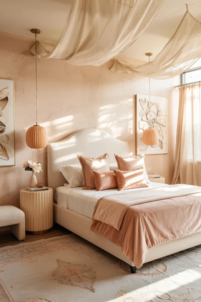
- Brings warmth and glow without feeling too bright
- Makes the room feel softer, lighter, and more cheerful
- Adds color in a gentle way that still feels restful
- Works beautifully with cream, gold, and light wood accents
A peach and ivory palette can make a bedroom feel instantly softer and more radiant, especially when the room needs warmth without heavy contrast. Peach adds a fresh glow that feels gentle rather than loud, while ivory keeps the overall look clean and balanced. Together, they create a space that feels uplifting and calm at the same time. I’ve noticed this pairing works especially well in bedrooms that feel dull in natural light, because the warm undertones help everything look more alive. The result feels cozy, polished, and quietly cheerful from morning to evening.
This combination also works because ivory gives peaches a clean foundation, which helps the color look elegant instead of overly playful. In my experience, peach is most beautiful when layered through bedding, art, or a soft wall treatment rather than used too aggressively everywhere. That is why many designers recommend warm fruit-inspired tones in muted versions for bedrooms. Visually, the room gains glow, softness, and subtle personality. Functionally, it stays easy to pair with neutral furniture, woven textures, and metallic details that keep the room feeling grounded, fresh, and beautifully styled.
11. Teal And Sand
- Adds color depth while still keeping the room grounded
- Makes the space feel richer and more intentional
- Brings a modern edge without losing warmth
- Pairs beautifully with brass, wood, and creamy neutrals
A teal and sand palette can make a bedroom feel rich, fresh, and grounded all at once. The deep blue-green brings personality and visual depth, while sand softens the look and keeps the room from feeling too cool. Together, they create a balanced mix of color and calm that feels modern but still welcoming. I’ve seen this work well in many homes because teal adds a more distinctive mood than standard blues while still feeling restful enough for a bedroom. The overall effect is layered, sophisticated, and full of quiet energy without becoming overwhelming.
This palette also works beautifully because sand tones help warm up teal in a very natural way. In my experience, this is one of those color pairings that looks especially striking with brass lighting, walnut furniture, and textured neutral fabrics. That is why many designers recommend anchoring stronger hues with soft earthy tones instead of stark white. Visually, the room gains contrast, glow, and a more custom feel. Functionally, it remains flexible enough to style through changing seasons, which makes it a practical choice for bedrooms that need both personality and long-term ease.
12. Butter Yellow And White

- Brightens the room in a soft and welcoming way
- Adds a sunny tone without feeling overpowering
- Helps dark or flat bedrooms feel more alive
- Creates a fresh, uplifting mood with very little effort
Butter yellow and white can make a bedroom feel like it is filled with soft morning light even on ordinary days. The yellow brings warmth and brightness, while white keeps the palette airy and clean. Together, they create a space that feels cheerful but still calm enough for rest. I’ve noticed this pairing works especially well in bedrooms that feel a little dull or shadowy, because it gently lifts the whole room without needing a major redesign. The result feels fresh, optimistic, and beautifully light from the moment you step inside.
This combination also works because butter yellow is much easier to live with than sharper, brighter yellows. In my experience, softer warm tones create a more comforting effect and blend better with natural materials like oak, linen, and woven textures. That is why many designers recommend pale yellow for spaces that need more personality but still want to feel restful. Visually, the room gains glow, charm, and a subtle sense of happiness. Functionally, it stays simple to style with white bedding and neutral furniture, which keeps the look balanced and easy to maintain.
13. Mocha And Cream
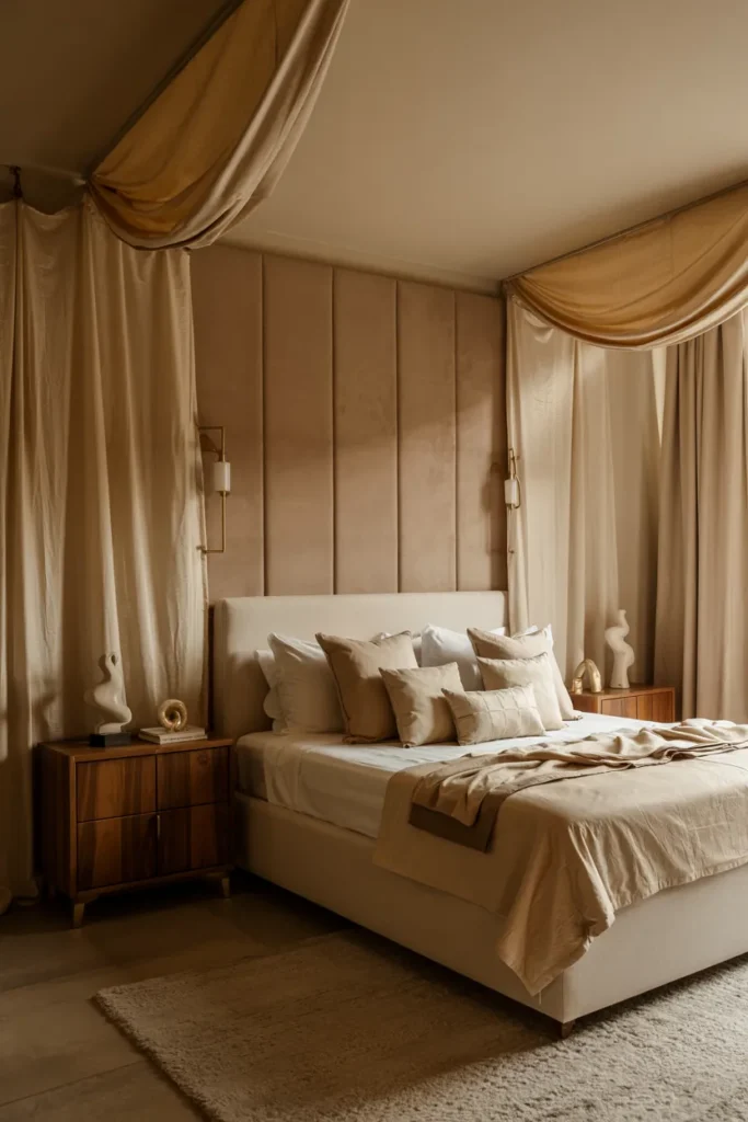
- Brings warmth and richness without making the room feel dark
- Creates a soft luxury look through layered neutral contrast
- Makes cream bedding and decor stand out more beautifully
- Works especially well with walnut, bronze, and textured fabrics
A mocha and cream palette can make a bedroom feel instantly warmer, richer, and more elevated without needing strong color. The deeper brown tone adds depth and comfort, while cream keeps the room soft, light, and balanced. Together, they create a calm setting that feels polished rather than plain. I’ve noticed this pairing works especially well in bedrooms that need more presence but still want to stay restful. The room starts to feel cocooning and refined, with a gentle glow that comes from tonal layering instead of sharp contrast or bright decorative accents.
This combination also works because it makes texture stand out in the most beautiful way. Cream bedding, boucle benches, woven rugs, and soft curtains all feel more luxurious when they sit beside a warm mocha backdrop. In my experience, this is one of the easiest color pairings to keep looking timeless because it feels natural and grounded. That is why many designers recommend rich neutrals when a bedroom needs more depth without losing softness. Visually, the space feels fuller and more serene. Functionally, the palette stays easy to refresh with subtle seasonal accents.
14. Sky Blue And Linen
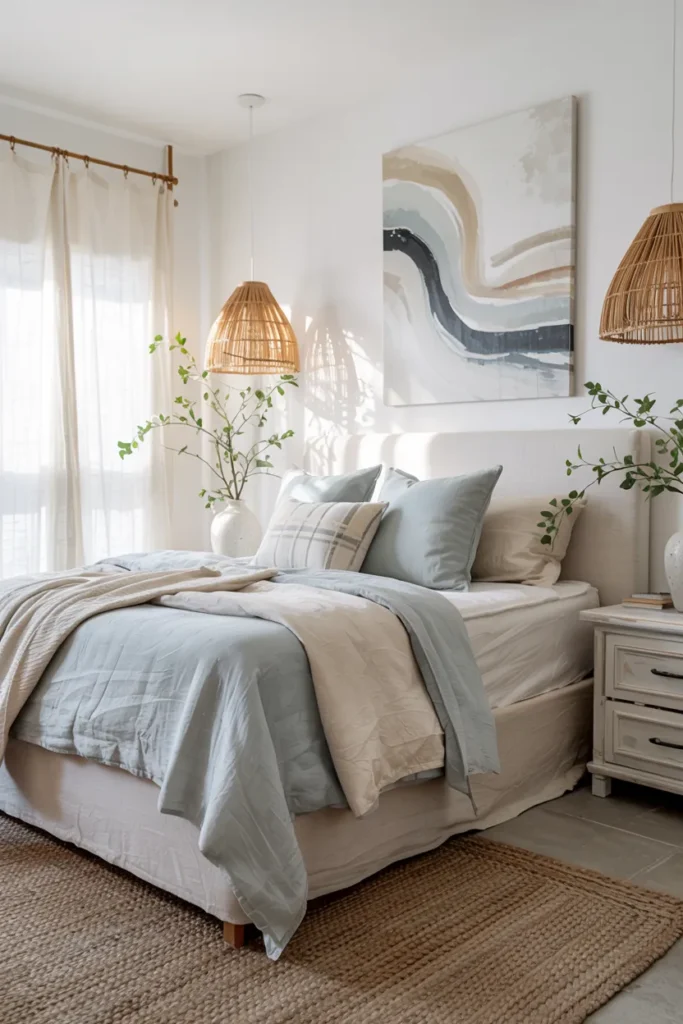
- Makes the room feel lighter, fresher, and more open
- Adds color in a soft way that still feels restful
- Creates a clean airy glow without looking cold
- Pairs beautifully with natural wood and woven accents
Sky blue and linen can make a bedroom feel fresh and weightless, almost like the room is breathing more easily. The soft blue adds a gentle wash of color, while linen tones keep everything warm and grounded. Together, they create a space that feels open, clean, and beautifully calm. I’ve seen this work well in many homes because it brightens the room without making it feel sharp or overly styled. The overall effect is peaceful and airy, with a subtle glow that feels especially beautiful in natural daylight and slow morning light.
This palette also works because linen shades help soften blue in a very natural way. In my experience, pairing cool color with warm texture is what keeps the bedroom from feeling flat or too coastal in theme. That is why many designers recommend adding woven materials, oak finishes, and soft fabric layers when using blue in rest spaces. Visually, the room gains lightness, balance, and a relaxed elegance. Functionally, it stays easy to live with, making it a great option for bedrooms that need both freshness and long-term comfort.
15. Plum And Beige
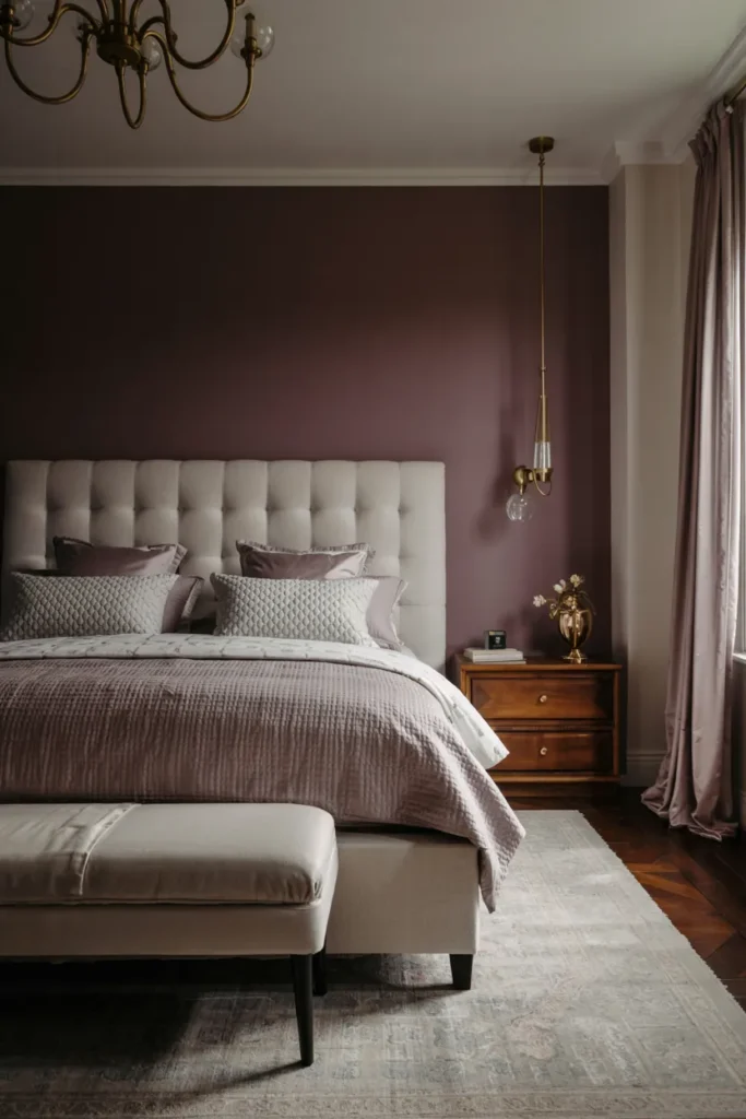
- Adds a dramatic rich tone without making the room harsh
- Makes beige elements look warmer and more luxurious
- Brings a moody glow that still feels soft and restful
- Helps plain bedrooms feel more memorable and refined
Plum and beige can make a bedroom feel dramatic, warm, and unexpectedly elegant all at once. The deep purple tone adds mood and richness, while beige keeps the space grounded and approachable. This balance is what makes the pairing feel so special. Instead of looking too dark or too delicate, the room lands in a beautiful middle space that feels luxurious and calm. I’ve noticed this works especially well in bedrooms that need more personality, because plum creates an immediate focal point. The result feels layered, glowing, and far more polished than flat neutral schemes.
This pairing also works because beige softens plum in a way that keeps the overall mood restful. In my experience, deeper jewel tones look best in bedrooms when they are balanced by warm neutrals and soft textures. That is why many designers recommend pairing bold color with creamy upholstery, layered bedding, and warm wood finishes. Visually, the room gains depth, romance, and stronger contrast. Functionally, it still feels comfortable and grounded, especially when the lighting stays warm and the surrounding decor remains simple enough to let the palette do the work.
16. Forest Green And Gold
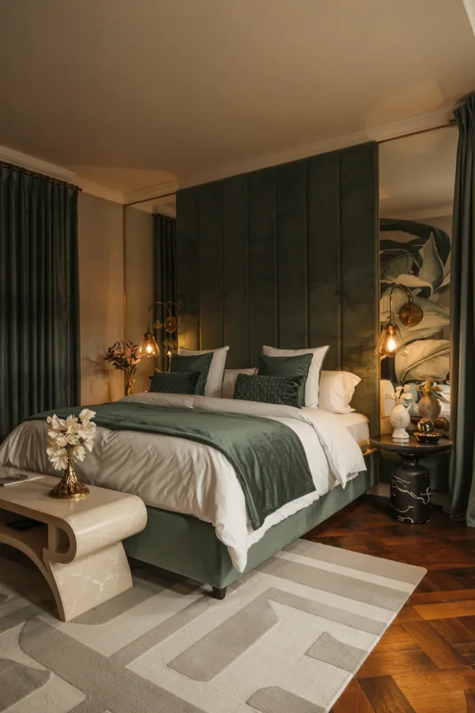
- Adds bold depth while still feeling restful and rich
- Makes metallic accents glow in a more dramatic way
- Gives the room a luxe boutique-hotel atmosphere
- Works especially well with velvet, wood, and marble textures
A forest green and gold palette can make a bedroom feel instantly richer, deeper, and far more dramatic in the best possible way. The green brings a grounding natural mood, while gold adds warmth and glow that keeps the room from feeling too heavy. Together, they create a setting that feels elegant and cocooning rather than dark. I’ve noticed this pairing works especially well in rooms that need more personality, because the color creates instant impact without relying on busy patterns. The result feels polished, luxurious, and beautifully layered from the walls to the lighting.
This combination also works because gold naturally lifts deep green and makes it feel more refined. In my experience, the palette looks most beautiful when the metallic accents stay warm and the fabrics feel tactile, like velvet, linen, or soft woven textures. That is why many designers recommend richer jewel tones when a bedroom needs more depth and visual interest. Visually, the room gains drama, warmth, and a more custom feel. Functionally, it still supports rest because the tones feel grounded, soft, and especially flattering under warm evening lighting.
17. Coral And Soft White
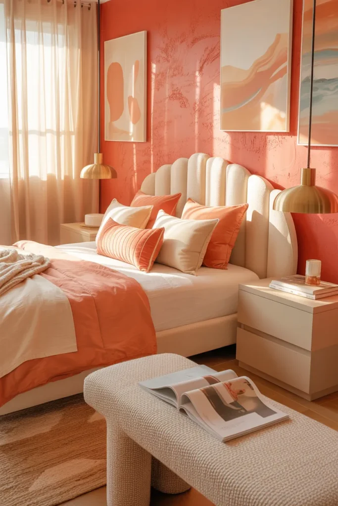
- Brings cheerful warmth without feeling too intense
- Makes the bedroom feel brighter and more alive
- Adds color in a playful but still polished way
- Works beautifully with soft white, oak, and brass details
Coral and soft white can make a bedroom feel brighter, warmer, and more uplifting almost immediately. The coral brings energy and glow, while soft white keeps the room feeling clean and breathable. Together, they create a balanced look that feels fresh rather than loud. I’ve seen this work well in many homes because it gives the space color without making it hard to relax in. The room starts to feel more personal and more joyful, with a light that seems warmer across the bedding, walls, and decor throughout the day.
This pairing also works because soft white gives coral room to shine without letting it take over the space. In my experience, this palette looks best when coral is softened slightly and repeated through textiles, art, or one key painted surface. That is why many designers recommend warm, muted versions of brighter tones for bedrooms. Visually, the room gains radiance, charm, and a welcoming sense of energy. Functionally, it remains easy to balance with neutral furniture and natural materials, which helps the space stay calm enough for everyday rest and comfort.
18. Chocolate And Camel
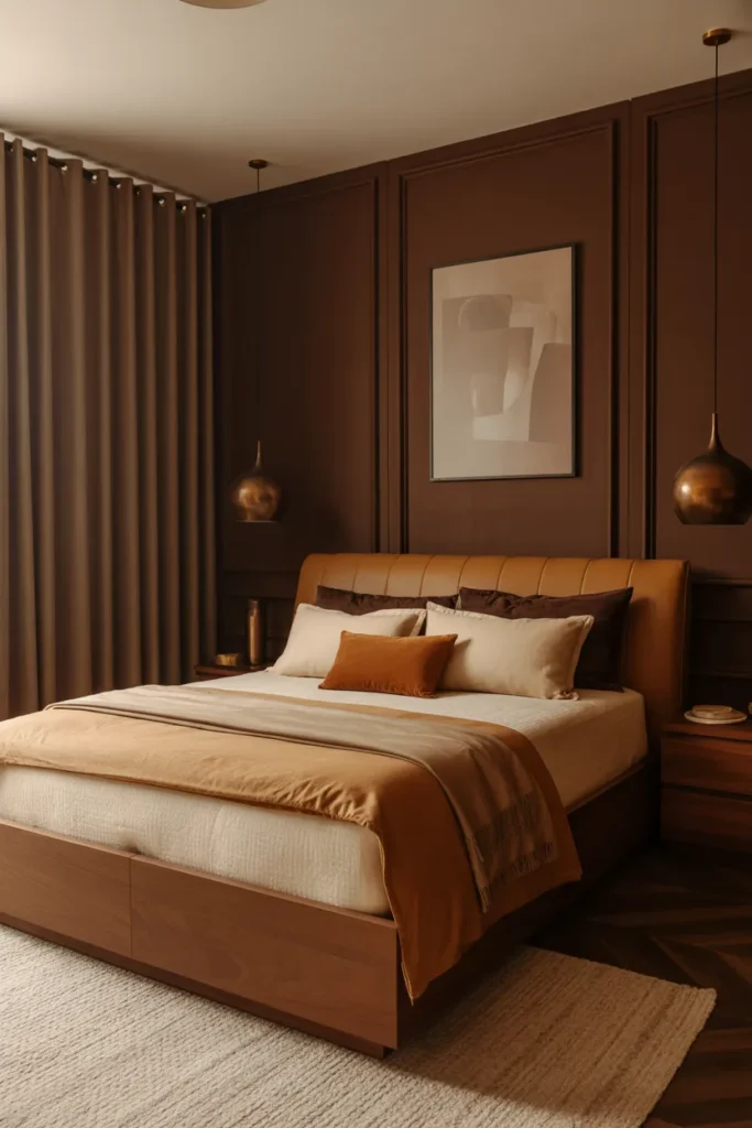
- Creates a deeply cozy and grounded atmosphere
- Makes warm neutrals feel more layered and expensive
- Adds strong contrast without using bright color
- Gives the room a refined and cocooning feel
Chocolate and camels can make a bedroom feel instantly grounded, warm, and incredibly sophisticated. The dark brown adds weight and richness, while the camel softens the mood and keeps the space from looking too heavy. Together, they create a luxurious tonal look that feels intimate and calming. I’ve noticed this pairing works especially well in larger bedrooms that need more depth, because the darker tone helps the room feel more enveloping. The result is cozy, refined, and full of warmth, with a quiet elegance that feels far more expensive than many lighter palettes.
This palette also works because camels bring a natural glow that helps chocolate feel softer and more inviting. In my experience, the combination becomes especially beautiful when layered with walnut, bronze, wool, and cream accents. That is why many designers recommend deep brown tones for rooms that want a richer mood without shifting into black or gray. Visually, the bedroom gains depth, texture, and a stronger architectural feel. Functionally, it remains restful and grounded, especially when balanced with lighter bedding and warm lighting that keeps the room from feeling closed in.
19. Mauve And Greige
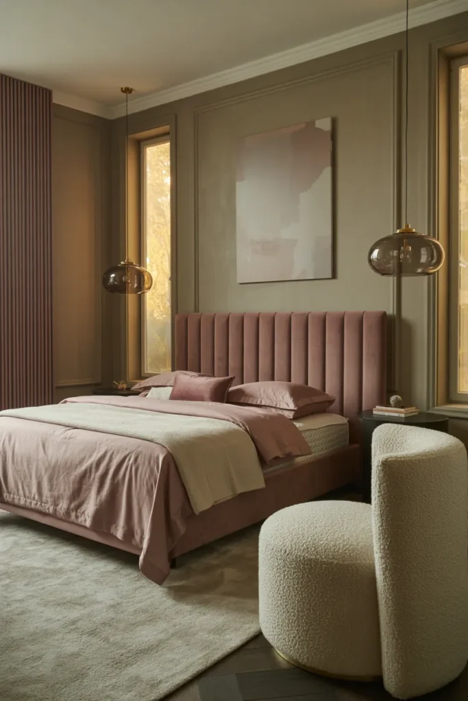
- Brings soft color into the room without losing a calm mood
- Makes neutral spaces feel more polished and intentionally styled
- Adds warmth and elegance through muted layered tones
- Works beautifully with brass, glass, and soft textured fabrics
Mauve and greige can make a bedroom feel instantly softer, more elevated, and more thoughtfully styled without looking overly sweet. The mauve brings a muted romantic glow, while greige keeps the room grounded and mature. Together, they create a balanced palette that feels refined rather than trendy. I’ve noticed this pairing works especially well when a bedroom feels too plain in standard beige or gray, because it adds a gentle personality without disrupting the peaceful mood. The result is a room that feels warm, graceful, and quietly luxurious from every angle.
This combination also works because greige supports mauve in a way that makes the color feel more expensive and easier to live with. In my experience, these tones look especially beautiful when layered through velvet, linen, boucle, and soft drapery rather than used in one flat finish. That is why many designers recommend dusty rose-adjacent tones when a room needs warmth but still wants restraint. Visually, the bedroom gains glow, softness, and depth. Functionally, the palette remains flexible enough for changing decor, making the room easy to refresh over time.
20. Emerald And Cream

- Adds a rich jewel-toned focal point without overwhelming the space
- Makes cream furniture and bedding look brighter and more refined
- Creates a dramatic but still restful atmosphere
- Gives the bedroom a more custom, designer-inspired feel
Emerald and cream can make a bedroom feel bold, rich, and beautifully polished while still staying restful enough for everyday life. The emerald adds drama and depth, while cream softens the palette and keeps the room light where it matters most. That balance is what makes this combination so effective. I’ve seen this work well in many homes because the green creates instant character without feeling too cold or too dark. The overall result feels luxurious, grounded, and visually striking, with a glow that comes from contrast and warmth working together.
This pairing also works because cream helps emeralds feel more elegant and less intense. In my experience, the color becomes especially beautiful when echoed in velvet accents, artwork, or one statement wall instead of covering every surface. That is why many designers recommend rich green as a feature tone paired with warm neutrals and brass details. Visually, the room gains depth, brightness, and a boutique-hotel mood. Functionally, it still feels calming, especially when the fabrics stay soft and the lighting stays warm enough to balance the stronger color story.
21. Powder Blue And Blush
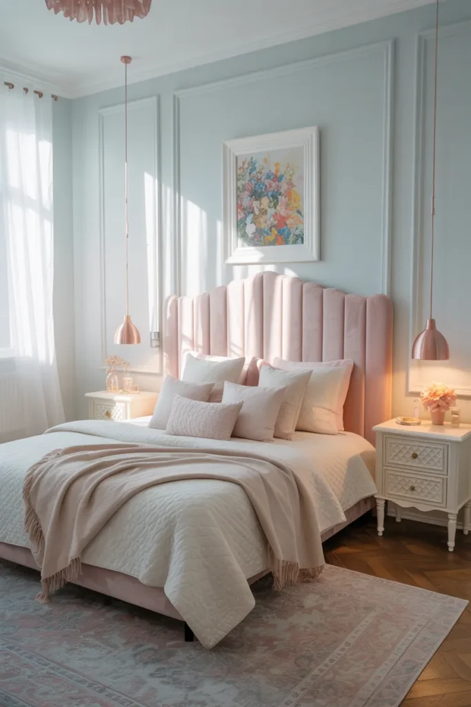
- Creates a light romantic look without feeling too childish
- Adds two soft colors that still feel airy and balanced
- Makes the bedroom feel brighter and more playful in a polished way
- Works beautifully with ivory, light oak, and rose-gold details
Powder blue and blush can make a bedroom feel airy, delicate, and softly glowing in a way that still feels refined. The blue keeps the palette fresh and calm, while blush adds warmth and a gentle romantic finish. Together, they create a balanced softness that feels more polished than overly pastel. I’ve noticed this pairing works especially well in bedrooms that need more charm and lightness, because it lifts the room without making it feel busy. The result is graceful, fresh, and visually soothing, with just enough color to make the space feel special.
This palette also works because each shade supports the other instead of competing for attention. In my experience, powder blue helps blush feel cleaner, while blush prevents blue from leaning too cool. That is why many designers recommend pairing soft opposites in muted tones when a bedroom needs more personality without losing calm. Visually, the room gains a gentle glow and more playful elegance. Functionally, it remains easy to ground with ivory bedding, pale wood furniture, and subtle metallic accents that keep the overall look restful, balanced, and beautifully cohesive.
22. Rust And Cream
- Brings a rich sunset-like warmth into the room
- Makes cream details feel brighter and softer
- Adds character without relying on loud color contrast
- Works beautifully with walnut, brass, and textured fabrics
Rust and cream can make a bedroom feel instantly warmer, softer, and more memorable without becoming too bold. The rust tone adds earthy richness and a glowing warmth, while cream keeps the palette open and breathable. Together, they create a bedroom that feels inviting and full of character. I’ve noticed this pairing works especially well when a room feels too plain or cool, because it adds depth in a very natural way. The result is cozy, stylish, and beautifully grounded, with a kind of warmth that feels comforting through both daylight and evening lighting.
This combination also works because cream helps rust feel refined rather than overpowering. In my experience, this palette becomes especially beautiful when layered with textured bedding, soft drapes, and warm wood tones. That is why many designers recommend clay-inspired shades when a bedroom needs more personality without losing its restful feel. Visually, the room gains glow, dimension, and a more curated look. Functionally, it stays easy to update with neutral accents and seasonal textures, which makes it a practical choice for bedrooms that need both warmth and long-term flexibility.
23. Mint And Sand

- Makes the bedroom feel fresher and more open
- Adds a gentle color lift without making the space busy
- Brings a light clean mood that still feels warm
- Pairs beautifully with oak, rattan, and linen textures
Mint and sand can make a bedroom feel fresh, airy, and softly glowing in a way that feels very easy to live with. The mint adds a gentle wash of color that brightens the room, while sand keeps everything grounded and calm. Together, they create a balanced palette that feels breezy but still warm enough for a restful space. I’ve seen this work well in many homes because it can wake up a dull room without making it feel loud. The result is light, cheerful, and beautifully relaxed from morning through night.
This pairing also works because sand tones stop mint from feeling too cool or too playful. In my experience, natural textures like woven lighting, oak furniture, and linen bedding make this palette look more elevated and less themed. That is why many designers recommend pairing soft greens with warm neutrals instead of bright white. Visually, the bedroom gains freshness, softness, and a clean natural glow. Functionally, the colors remain easy to decorate around, which helps the room stay polished and inviting even when the furniture and layout are fairly simple.
24. Burgundy And Oatmeal
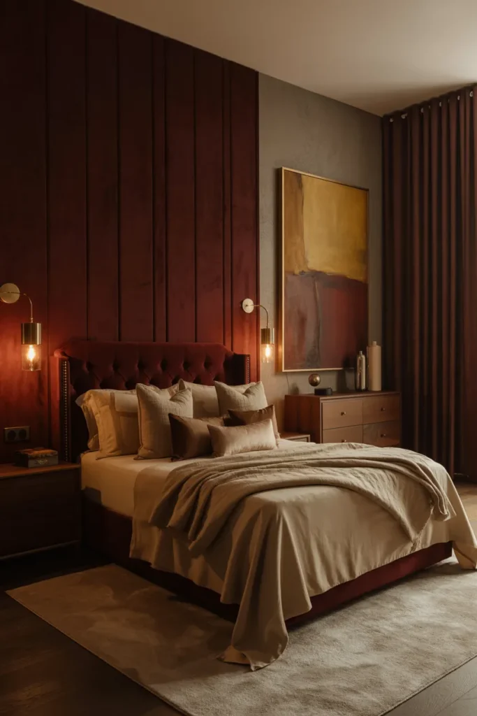
- Adds depth and drama with a softer neutral balance
- Makes the room feel more intimate and high-end
- Gives pale bedding a richer and more luxurious backdrop
- Works especially well with bronze, walnut, and velvet textures
Burgundy and oatmeal can make a bedroom feel deeply cozy and surprisingly elegant at the same time. The rich wine tone brings drama and warmth, while oatmeal softens the look and keeps the room feeling balanced. Together, they create a palette that feels luxurious without becoming too dark or formal. I’ve noticed this pairing works especially well in bedrooms that need more mood, because burgundy adds instant presence and depth. The overall effect is cocooning, polished, and full of quiet richness, with a color story that feels both bold and beautifully grounded.
This combination also works because oatmeal keeps burgundy from overpowering the room. In my experience, the pairing looks most elevated when the deeper tone appears through one statement surface, headboard, or layered textiles rather than taking over every wall. That is why many designers recommend using warm pale neutrals with jewel-like shades in sleep spaces. Visually, the room gains contrast, softness, and a more boutique feel. Functionally, it still feels restful under warm lighting, especially when the surrounding materials stay tactile, simple, and thoughtfully layered.
25. Aubergine And Champagne
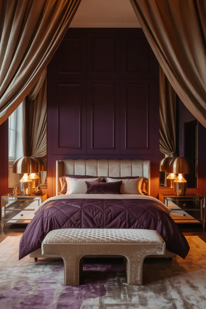
- Creates a rich dramatic look that still feels soft and elegant
- Makes lighter fabrics and metallic details glow more beautifully
- Adds a luxe boutique-hotel mood without feeling too dark
- Works especially well with velvet, gold, glass, and layered lighting
Aubergine and champagne can make a bedroom feel instantly dramatic, polished, and deeply luxurious without losing its sense of comfort. The deep purple adds richness and depth, while champagne softens the mood with warmth and a subtle glow. Together, they create a space that feels bold but still restful, which is what makes this pairing so effective. I’ve noticed this combination works especially well when a room needs more personality without becoming chaotic. The result is elegant, cocooning, and visually memorable, with a kind of evening glow that feels elevated and beautifully refined.
This pairing also works because champagne keeps aubergine from feeling too heavy or closed in. In my experience, the palette becomes especially beautiful when layered through velvet upholstery, warm metallic accents, soft drapery, and creamy bedding. That is why many designers recommend pairing jewel tones with luminous neutrals instead of stark white. Visually, the room gains contrast, softness, and a more custom high-end feel. Functionally, it still supports relaxation because the tones stay warm and flattering, especially under ambient lighting that enhances the richness of the entire space.
Conlusion:
The right colors can turn an ordinary bedroom into a space that feels warmer, softer, brighter, and more personal every single day. These Bedroom Color Schemes are meant to help you find a look that feels beautiful, calming, and truly right for your home. I’ve seen how even one thoughtful color change can completely shift the mood of a room and make it feel more finished. Save this post on Pinterest for later, try one or two ideas in your own space, and share it with anyone who wants a bedroom that glows with comfort and style.