22 Kitchen Color Palette Ideas for a Stylish Kitchen Update
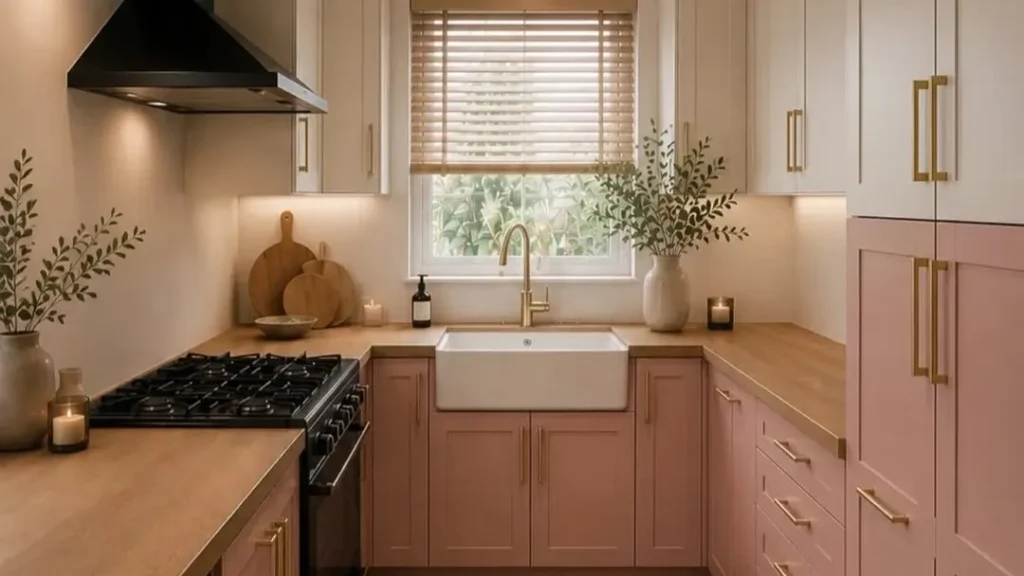
A thoughtful color scheme can make even an ordinary kitchen feel fresh, connected, and full of personality. These Kitchen Color Palette Ideas show how paint, cabinetry, tile, wood, and smaller accents can work together without making the room feel busy. Whether you prefer soft neutrals, cheerful pastels, deep greens, or bold retro shades, the goal is to help you build a look that suits your home rather than copy a picture exactly.
In my experience, the most successful kitchens repeat a few colors in practical places, such as stools, lighting, rugs, or backsplash details. This article offers realistic combinations for bright rooms, compact layouts, modern homes, and cozy family kitchens, making it easier to choose tones that feel stylish now and remain comfortable in everyday use.
1. Bright Orange and Cream Retro Kitchen Palette
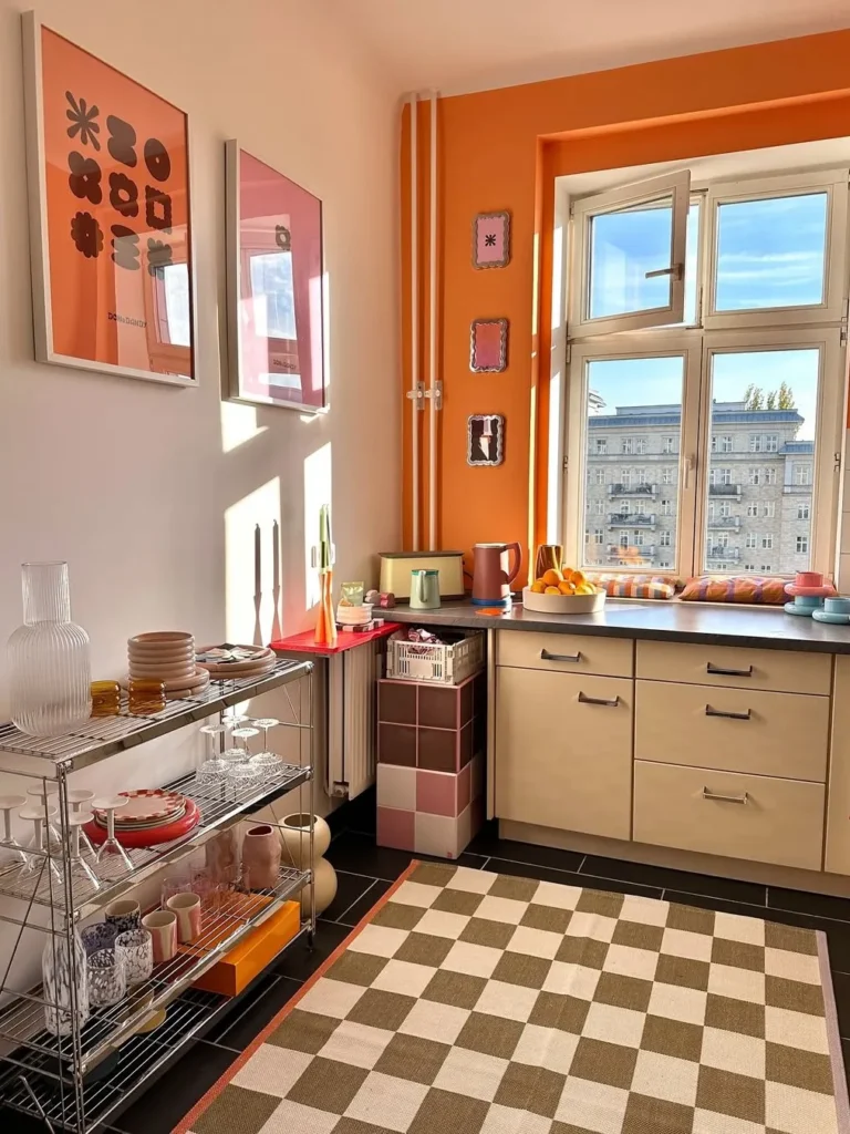
A burst of orange instantly turns a small kitchen into a cheerful, personality-filled corner. Cream cabinetry, black flooring, chrome shelving, and playful pink accents keep the strong wall color from feeling heavy while sunlight makes every warm tone look brighter.
This palette works especially well in apartments or compact kitchens where one vivid feature can carry the whole design. Keep larger surfaces neutral, repeat orange in only two or three accessories, and use open storage carefully so the room stays lively rather than cluttered.
2. Burgundy and Walnut Farmhouse Kitchen Palette
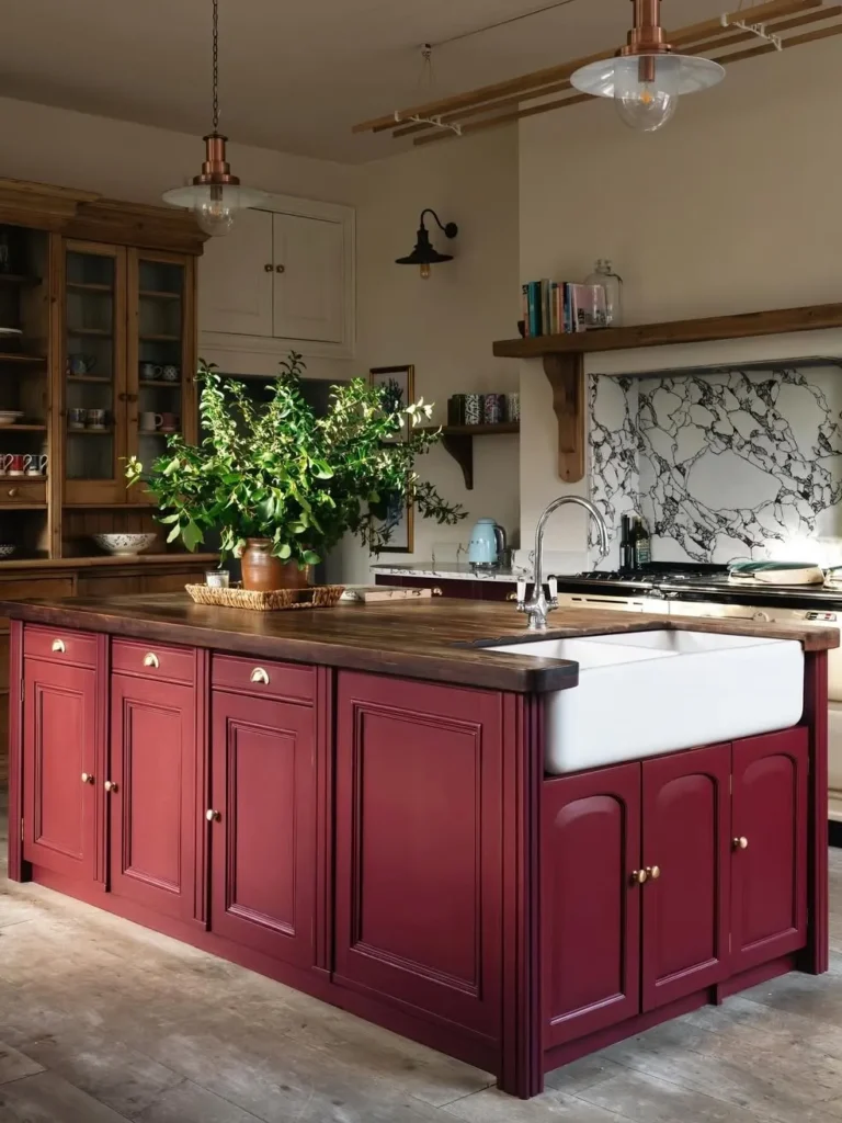
Deep burgundy gives this farmhouse kitchen a rich, grounded presence without losing its welcoming character. Walnut counters, warm wood storage, aged brass hardware, cream walls, and a dramatic veined backsplash create contrast while the large island remains practical for prep, washing, and gathering.
For real homes, use the darkest color on one major element instead of every cabinet. Pair it with natural timber and a pale sink or worktop, then soften the look with leafy branches and simple ceramics rather than adding more competing colors.
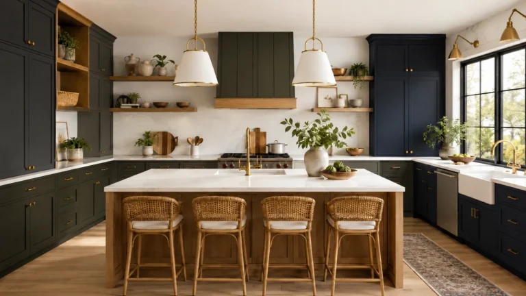
3. Classic White and Navy Blue Kitchen Color Palette
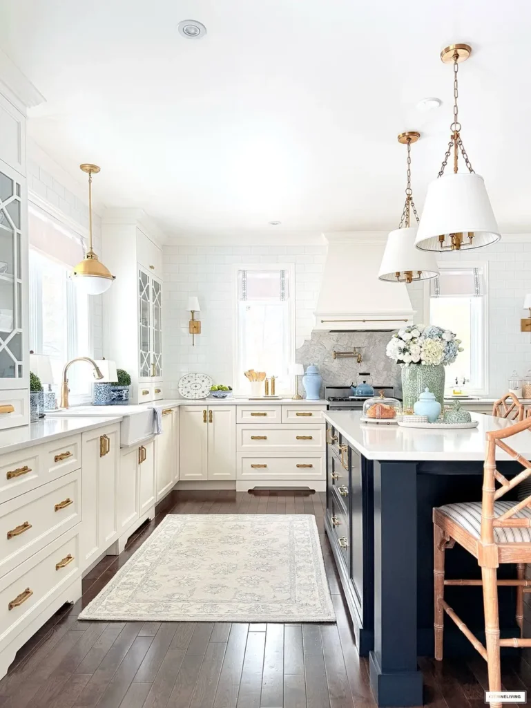
Few combinations feel as clean and dependable as crisp white paired with navy blue. White perimeter cabinets and walls reflect light, while the dark island anchors the long room and gives the pale surfaces enough contrast to avoid looking flat or overly formal.
Brass hardware, bamboo seating, soft blue pottery, and a light patterned runner gently warm the classic scheme. When adapting these Kitchen Color Palette Ideas, keep navy below eye level in smaller rooms and repeat it sparingly through textiles or serving pieces for balance.
4. Cream Cabinets with Cherry Red Checkerboard Tiles
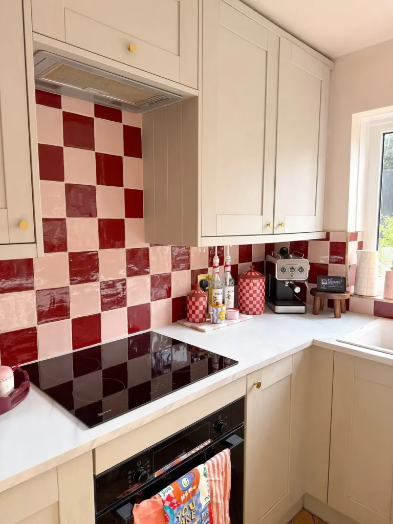
Cherry red checkerboard tiles turn an ordinary compact kitchen into a memorable, upbeat workspace. Soft cream cabinets and pale countertops calm the bold backsplash, while small brass knobs add gentle visual warmth without fighting the glossy red and blush squares.
Because the pattern already supplies plenty of movement, surrounding surfaces should stay quiet and practical. Copy the idea with a removable tile decal for a renter-friendly update, and keep countertop appliances grouped together so the playful design still feels organized.
5. Dusty Teal and Warm Peach Kitchen Color Palette
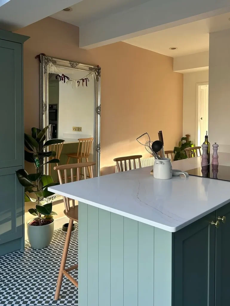
Dusty teal cabinetry and warm peach walls create an unexpected pairing that feels gentle rather than sugary. The white quartz island brightens the center, black-and-white flooring adds structure, and natural wood chairs stop the pastel shades from appearing too polished or delicate.
This combination suits open kitchens where color can help define the cooking area from nearby rooms. Choose muted versions of both shades, then repeat teal through one tall cabinet and the island so the palette reads as deliberate instead of scattered.
6. Fresh Green Farmhouse Kitchen Color Palette
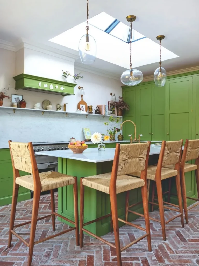
Fresh green cabinetry brings outdoor energy into a spacious farmhouse kitchen without relying on extra decoration. Brick flooring, woven counter stools, white walls, glass pendants, and a large skylight beautifully balance the saturated paint with natural texture and strong daylight.
For a similar result, let green cover the main cabinets and keep counters simple and pale. Avoid mixing several unrelated accent colors; clay pots, timber seating, flowers, and brass taps already provide enough variation for a layered but controlled finish.
7. Fresh Olive Green and Wood Kitchen Color Palette
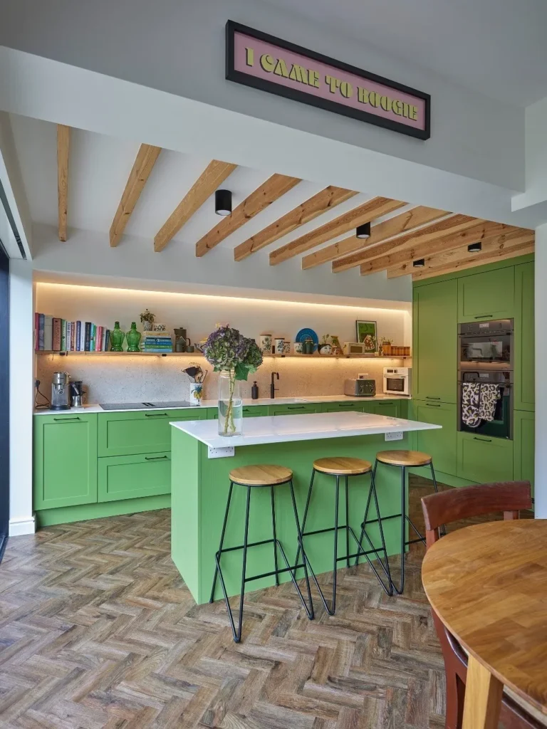
Olive green feels calmer and more architectural when paired with warm peach walls and graphic black-and-white flooring. A broad white island creates visual breathing room, while pale wood chairs, leafy plants, and an oversized mirror make the kitchen feel connected to the dining area.
Use this palette when you want color that still behaves like a neutral in daily life. Test the olive in both morning and evening light, then keep wall decor minimal because the patterned floor and painted cabinetry already supply strong visual interest.
8. Minimal Beige and Marble Kitchen Color Palette
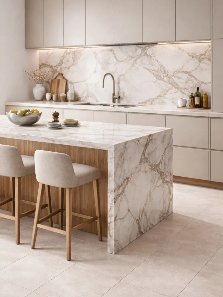
Soft beige cabinetry and sweeping marble surfaces create a kitchen that feels refined without becoming cold. The waterfall island, matching backsplash, pale floor tiles, slim metallic tap, and upholstered stools rely on subtle texture rather than strong color for their impact.
This approach works best when every neutral has a slightly warm undertone, helping stone, wood, and fabric sit comfortably together. Add concealed lighting beneath upper cabinets and keep accessories limited to useful pieces so the marble remains the clear focal point.
9. Mustard Yellow and Black Modern Kitchen Palette
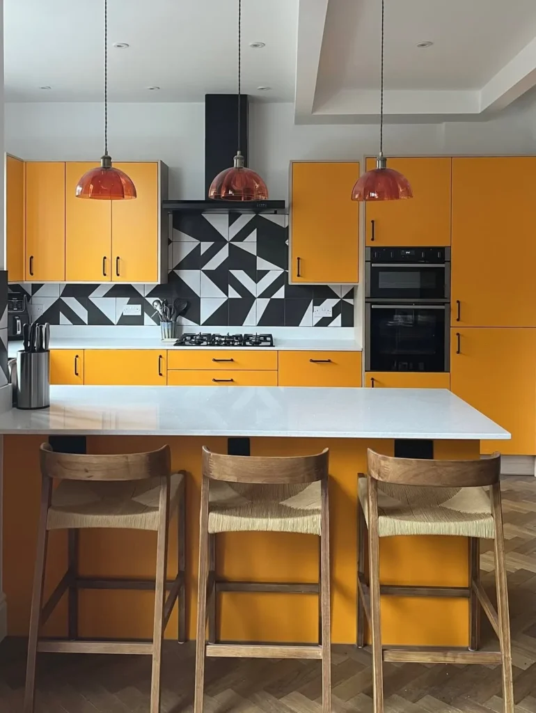
Mustard yellow cabinets bring confident warmth to a modern kitchen, especially beside a sharp black-and-white geometric backsplash. Rose-tinted pendants soften the graphic lines, while natural wood stools and a white counter make the strong cabinet color easier to live with.
For a practical update, use mustard on flat cabinet fronts and keep handles, appliances, and lighting simple. This is one of those Kitchen Color Palette Ideas that benefits from restraint, so avoid adding more bold patterns once the backsplash is in place.
10. Navy Blue and White Kitchen Color Palette Ideas
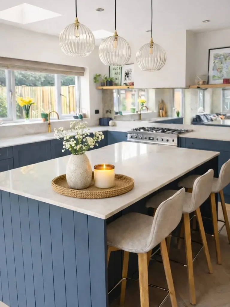
Navy blue islands and lower cabinets give this bright kitchen depth while white walls and countertops keep it open. Ribbed glass pendants, pale upholstered stools, brass taps, mirrored backsplash panels, and warm wood details create a polished mix of cool and warm finishes.
The palette works particularly well in kitchens with generous daylight because navy can otherwise absorb too much brightness. In smaller rooms, limit the dark shade to the island or base cabinets, then use reflective surfaces and light flooring to maintain an airy result.
11. Olive Green and Coral Vintage Kitchen Palette
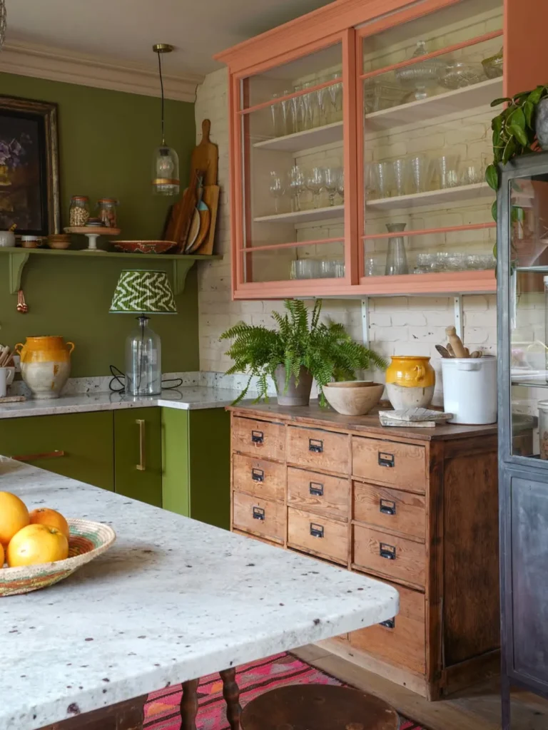
Olive green and coral create a collected kitchen that feels cheerful without losing its vintage character. Green base cabinets ground the room, while coral-framed glass cupboards, warm wood drawers, white brick, yellow pottery, and a bright woven rug build personality through layered but related tones.
For a practical version, keep green on the permanent cabinetry and introduce coral through one upper unit, painted trim, or removable accessories. Let natural timber and clear glass soften the stronger colors, and avoid filling every open surface so the varied storage pieces still look intentional.
12. Olive Green and Rustic Terracotta Kitchen Palette
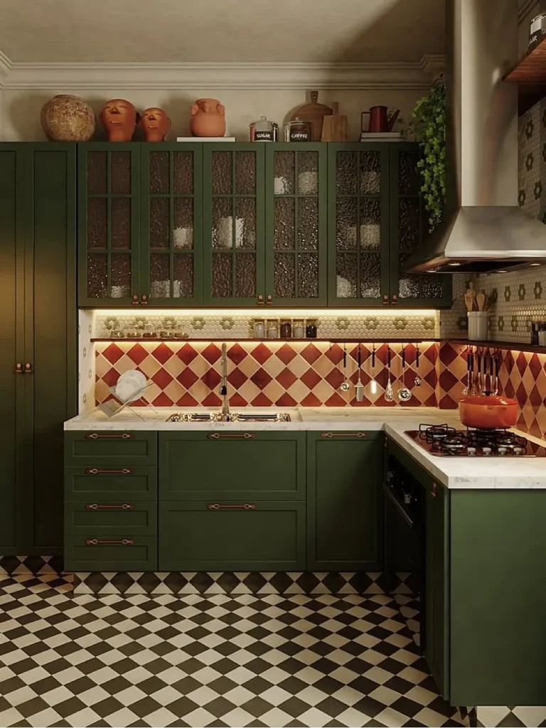
Dark olive cabinetry gives this compact kitchen a rich, traditional base, while rustic terracotta tiles add warmth and movement around the work area. Textured glass doors, copper-toned hardware, black-and-white flooring, and pottery displayed above the cabinets make the scheme feel dramatic yet lived in.
This combination suits kitchens with warm artificial lighting, where red clay shades can glow instead of turning harsh. Keep counters pale for contrast, repeat terracotta only in a few cooking pieces, and use under-cabinet lighting so the deep green fronts remain practical after sunset.
13. Pastel Blue and Blush Pink Kitchen Color Palette
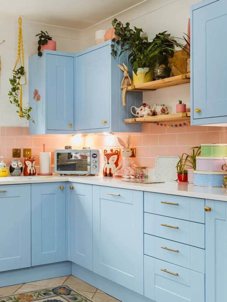
Pastel blue cabinets and a blush pink backsplash turn a corner kitchen into a lighthearted, welcoming place. Brass handles, pale counters, open timber shelves, trailing plants, and small decorative pieces add warmth, preventing the gentle color pairing from feeling flat or overly childlike.
Choose slightly dusty versions of blue and pink if you want the palette to age well. Keep appliances and worktops neutral, then limit novelty decor to one shelf or corner; the room will still feel personal while daily cooking areas stay clear and easy to clean.
14. Playful Pink and Orange Retro Kitchen Palette
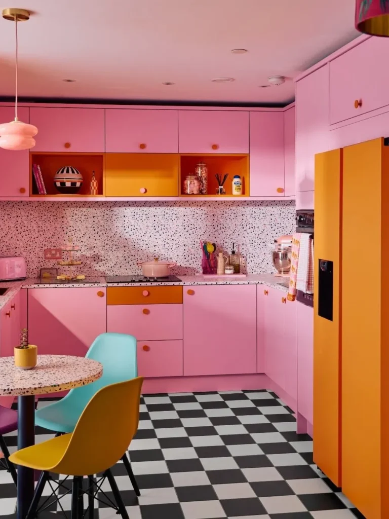
Pink cabinetry and orange accents bring true retro energy to this compact kitchen, especially against the black-and-white checkerboard floor. Speckled counters, colorful chairs, an orange refrigerator, and rounded lighting make the bold palette feel playful, coordinated, and full of movement.
Because every surface already has visual impact, organization matters more here than in a neutral kitchen. Store most everyday tools behind closed doors, repeat orange in only a few fixed spots, and leave some pink areas unbroken so the design feels energetic rather than chaotic.
15. Rust Red and Deep Teal Modern Kitchen Palette
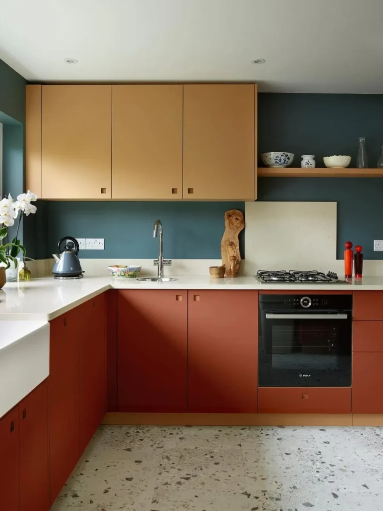
Rust red lower cabinets and deep teal walls create a strong, modern contrast that feels warmer than black and white. Mustard upper cabinets, pale worktops, open shelving, sculptural wood decor, and a light terrazzo-style floor keep the compact layout balanced and surprisingly calm.
Use the darkest shade on the wall or a limited cabinet run, then place rust below eye level for a grounded result. A light countertop is essential here because it separates the saturated colors, improves visibility, and prevents the work zone from becoming visually heavy.
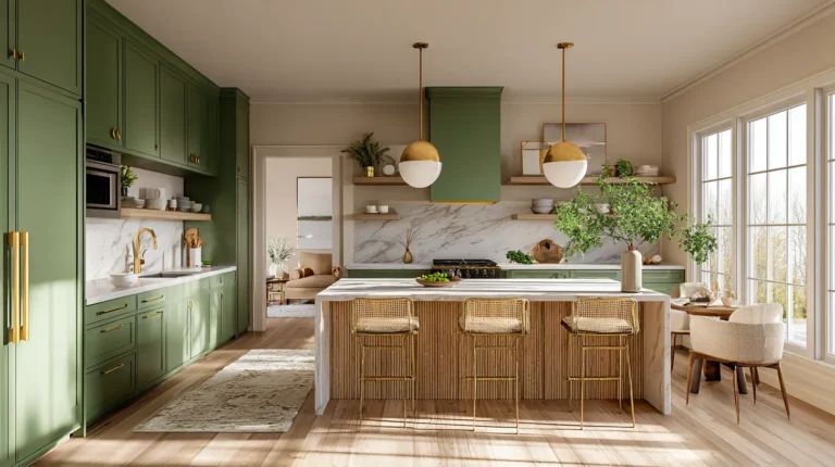
16. Sage Green and White Timeless Kitchen Palette
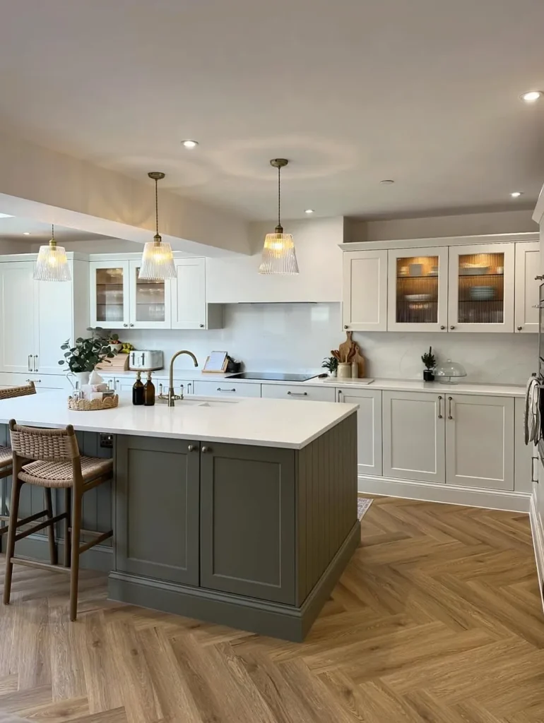
Sage green on the island gives an all-white kitchen a softer, more welcoming center without reducing brightness. Ribbed glass cabinet doors, warm pendant lights, woven stools, pale counters, and herringbone wood flooring add texture while keeping the overall palette calm and familiar.
This is an easy approach for homeowners who want color without repainting every cabinet. Focus the green on one island or freestanding unit, repeat it through a small plant or textile, and keep surrounding finishes warm white rather than stark blue-white for a more connected look.
17. Sky Blue and Sunshine Yellow Kitchen Palette
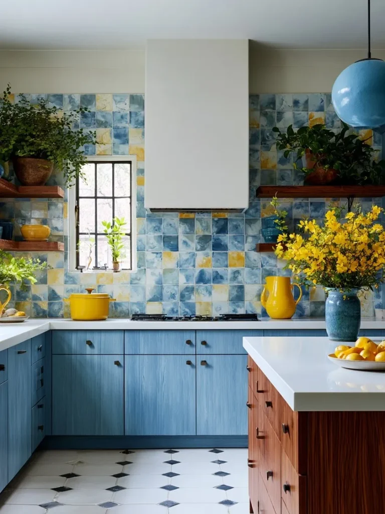
Sky blue cabinetry and sunshine yellow accents make this kitchen feel bright even before the lights are switched on. Watercolor-style backsplash tiles, a wood-front island, yellow flowers, open shelves, and a blue globe pendant turn the simple layout into a cheerful, artful cooking space.
To stop blue and yellow from becoming too themed, use one as the main cabinet color and the other in smaller, movable details. White counters and a restrained floor pattern give the eyes somewhere to rest, while natural wood helps both colors feel more mature.
18. Soft Blush and Sage Green Kitchen Color Palette
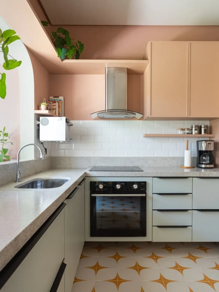
Soft blush upper cabinets and pale sage lower cabinets give this small kitchen a gentle, layered look. White subway tiles, a speckled countertop, black linear handles, mustard-patterned flooring, and a few plants add definition without overpowering the muted cabinet colors.
This pairing works well where you want warmth but still need the room to feel light. Keep the blush slightly earthy, choose sage with a gray undertone, and use slim dark hardware to outline the cabinetry; too many pastel accessories would make the result feel less polished.
19. Soft Blush Pink Kitchen Color Palette Inspiration
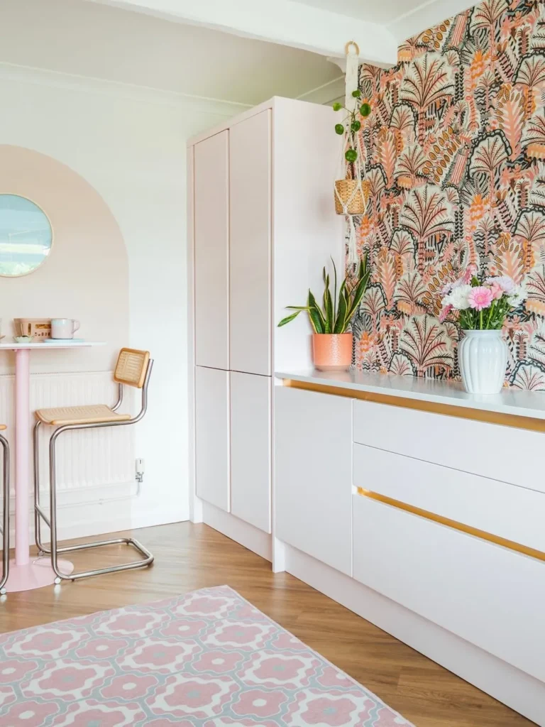
Soft blush cabinetry feels fresh and modern when it is treated as a quiet background rather than the only feature. Bold botanical wallpaper, brass drawer pulls, a pale patterned rug, chrome seating, and green plants bring contrast while preserving the airy quality of the pale pink units.
For a renter-friendly take, keep cabinets neutral and apply blush through peel-and-stick panels or painted furniture. One wallpapered section can carry most of the pattern, so leave neighboring walls simple and repeat only two accent colors to maintain a clean, edited finish.
20. Walnut Wood and Terracotta Kitchen Color Palette
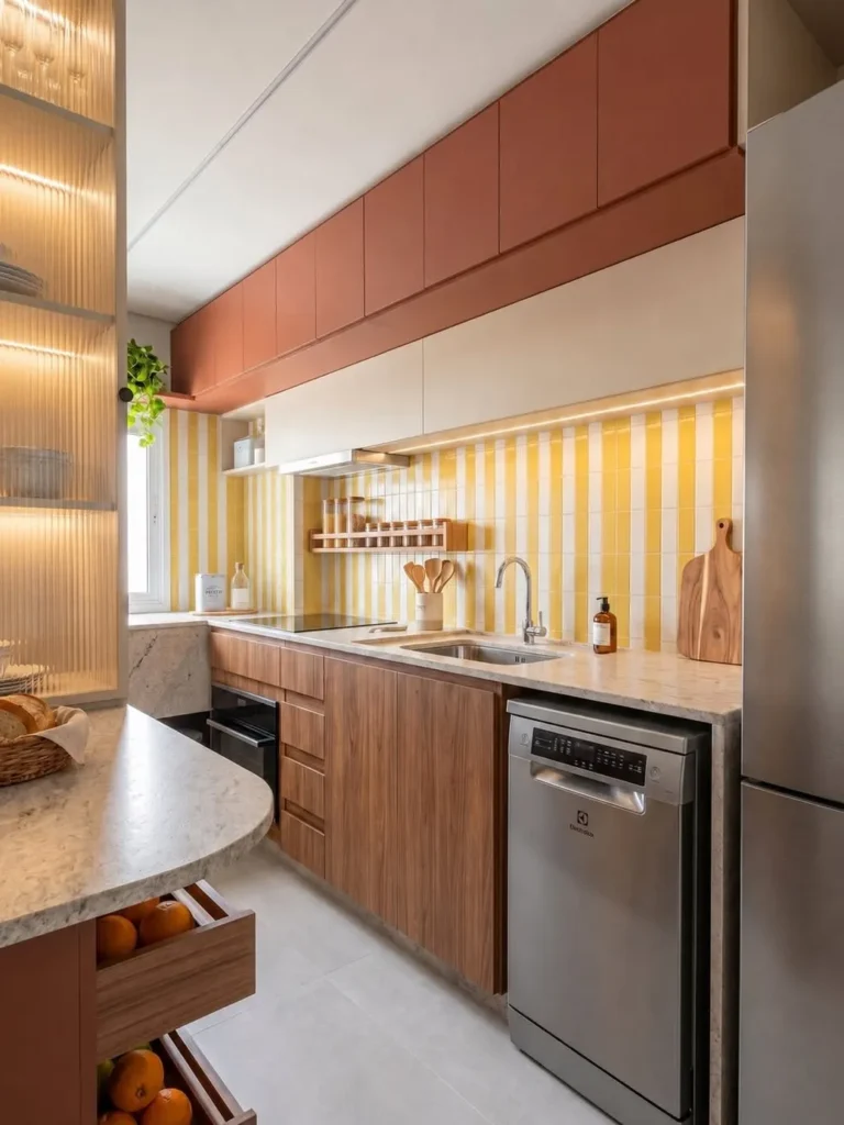
Walnut fronts and terracotta upper cabinets create a narrow kitchen with warmth, depth, and a clear sense of rhythm. Vertical yellow-and-white tiles, cream cabinets, stainless appliances, marble-look counters, and concealed lighting brighten the long layout while highlighting its streamlined storage.
In galley kitchens, use the stronger color above or at the far end so the walkway does not feel boxed in. Keep lower fronts in natural wood, choose reflective or pale counters, and run lighting beneath the wall cabinets to make preparation areas brighter and visually wider.
21. Warm Butter Yellow Cozy Kitchen Color Palette
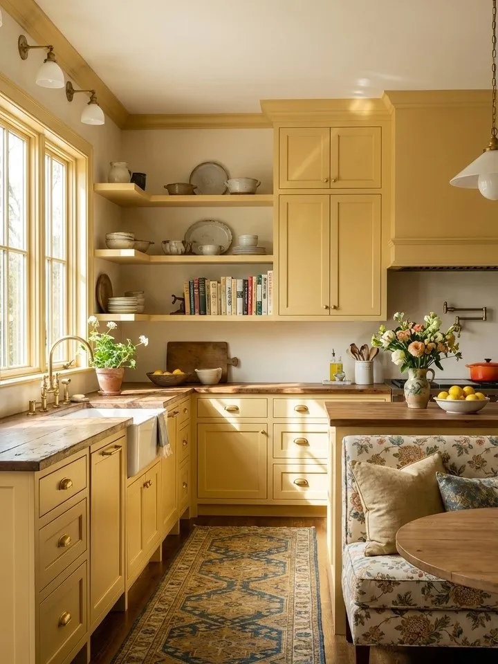
Butter yellow cabinetry gives this compact kitchen a sunny, welcoming character without feeling overly bright. Open shelves, warm wood counters, brass hardware, a patterned runner, and a floral breakfast nook soften the color, while the large window keeps the palette lively and naturally balanced.
For everyday use, choose a muted yellow with a creamy undertone and repeat it across cabinets rather than many small accessories. Keep counters lightly styled, use aged brass instead of shiny gold, and bring in wood, woven textiles, or vintage pottery so the room feels warm rather than themed.
22. Warm Greige and Natural Wood Kitchen Palette
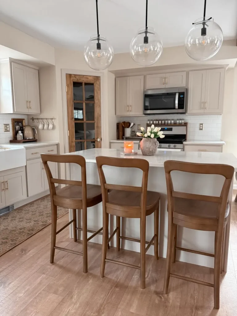
Warm greige cabinets create a calm backdrop that lets natural wood and soft lighting carry the visual warmth. Clear globe pendants, a pale island, white tile, medium-tone stools, and a rustic glass door keep the kitchen neutral while still giving it texture, contrast, and personality.
This palette works especially well for homeowners who want an easy update that will not date quickly. Match greige to the room’s daylight, keep wood tones consistent, and avoid adding too many cool grays; a few warm accessories, a faded runner, and simple flowers are enough to finish the look.
Practical Ways to Build a Palette That Feels Like Home
- Start with the mood, not an exact copy. Decide whether you want the kitchen to feel cheerful, calm, warm, or dramatic. Use the featured rooms as inspiration, then adjust the colors to suit your lighting, existing finishes, and daily routine.
- Choose one clear focal point. Colorful cabinets, a patterned backsplash, or a painted island can provide enough personality on its own. Keeping the remaining surfaces quieter prevents competing details from making the kitchen feel busy.
- Build on a simple foundation. White, cream, soft gray, or natural wood creates an easy base for stronger shades. This approach also makes future updates easier because accessories can change without requiring a complete renovation.
- Introduce color in smaller layers. Stools, artwork, dish towels, planters, lamps, and cookware offer affordable ways to test new tones. Renters can use removable wallpaper, peel-and-stick tiles, or painted freestanding furniture for a similar effect.
- Keep countertops useful. Choose low bowls, compact plants, and short flower arrangements so prep areas remain practical and conversation across an island stays comfortable.
- Repeat a limited palette. Carry two or three colors through textiles, decor, hardware, and nearby rooms. Repeating a few materials—such as wood, woven fiber, ceramic, or brass—helps different elements feel connected.
- Leave breathing room. Not every shelf, wall, or counter needs decoration. A little empty space makes chosen colors appear stronger and keeps cleaning manageable.
A beautiful kitchen does not need to be perfectly matched or heavily styled. With a thoughtful focal point and a few repeated details, it can feel personal, polished, and easy to enjoy every day.